Category: Uncategorized
The Road Back from Dartmouth Deception Will Be Difficult, but We Must Now Begin
Reed Abelson and Gardiner Harris, whose previous NY Times article characterized the Dartmouth Atlas as “shaky,” have responded to the rebuttal of their work by Dartmouth researchers, Elliott Fisher and Jonathan Skinner. Carefully and deliberately, they have shown how the Dartmouth team has pursued a consistent pattern of exaggeration and fabrication. It is this same pattern of deception that I described in papers in Health Affairs here and here, in the Washington Post, in letters to Congress here and here and in blog postings here and here and here and here and here and here and here and here and here and here and more. I pointed out that “The 30% Solution is a Treacherous Prescription for Health Care Reform.”
Over the past 18 months, I have referred to the Dartmouth group’s pattern of deception as “Dartmouth doubletalk,” “twisted truths,” “malarkey” and “voodoo statistics.” It should never have reached this point. In a letter to John Wennberg three years ago citing several such examples, I said, “I can find no way to characterize these statements as anything other than a deceptive misrepresentation of the data and intentional perversion of the truth. I don’t think it’s worth having them contaminate the enormous body of important work that has flowed from your enterprise. It would be so much better if you and your colleagues would rectify the misconceptions that have been created.” He chose not to, and his colleagues chose to progressively elevate the level of deception. I proceeded to publish the facts as I saw them, and now the New York Times has done the same.
Sadly, the Dartmouth Atlas and its misrepresentations by Dartmouth researchers have misled health care reform. Saddest of all, they have diverted attention from the policy needs that exist because of the high health care costs of poverty. The road back to truth and coherent policy will be long and difficult, but we must now begin.
Dartmouth vs. Dartmouth
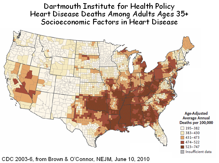
The infamous Dartmouth Atlas publishes maps that purport to report an association between increased Medicare spending and the wasteful overuse of supply sensitive services (top figure, below). But Brown and O’Connor, from the same research unit at Dartmouth, have published a very similar map, which they interpret as showing an association between increased deaths from heart disease and socioeconomic factors (bottom figure). So which is it: more deaths (and therefore more health care spending) due to socioeconomic factors, or more spending in many of the same areas because of the avarice of physicians?
I know that the Dartmouth Atlas crowd won’t listen to reason from me. They even had the audacity to say that almost none of the variation in their Medicare map is due to poverty (shame on them!). But I hope they will listen to their colleagues, Jeremiah Brown and Gerald O’Connor, whose June 10th paper in the NEJM gets it right. People are sicker where they are poorer, and it costs more to care for them.


Dartmouth Atlas Data Used to Justify Health Savings Can Be Shaky (NYT)
On June 3rd, NYT writers Reed Abelson and Gardiner Harris bravely published the truth about the Dartmouth Atlas – its use of data is shaky. Writing in the Washington Post last September, I called the Atlas the “Wrong Map for Health Care Reform.” Other than two pathetic rebuttals, one from the perpetrators of the Dartmouth hoax (Fisher and Skinner) and the other from its spinmeister (Gwande), the NYT has yet to publish objective commentary. Given the gullibility of its editorial page, which bought into Dartmouth doubletalk right from the start, it may never do so. And so, my brief response to the NYT follows:
To the Editor:
Abelson and Harris’s critical analysis of the Dartmouth Atlas unmasks the fact that it cannot be taken as a measure of expenditures in relation to quality, and therefore as a measure of value. Yet we are left to wonder, why are expenditures higher in some geographic regions than in others? The answer is that the Atlas’s geography is the geography of poverty. In some cases, poverty encompasses entire regions of the Atlas, particularly in the south, but more often poverty is concentrated within “poverty zones,” such as south Bronx, north Philadelphia or Watts, where it is masked within the Atlas’s units of analysis by the surrounding affluence. Health care expenditures per capita in such poverty zones are double those of their affluent neighbors, and such spending is not masked. As phrased by a colleague, “one persons affluence off-sets ten people’s poverty, but one poor-person’s health care spending in not off-set by even ten who are affluent.” The same pattern applies to expenditures within particular hospitals. Mayo is wrongly thought to be “efficient,” because its per patient expenditures are lower, but no lower than other hospitals in regions where population density is low and poverty rates are even lower. In contrast, hospitals in Los Angeles, which bear the burden of almost two million poor people, are wrongly viewed as “wasteful.” The lesson is that, while much can be done to improve our health care system, all efforts pale in comparison to addressing the higher expenditures required in caring for the poor.
Berwick’s Rules, Wennberg’s Windfall and the Quality-Industrial Complex
Quality and value are important. But are they best achieved through professionalism or regulation? In 1996, Donald Berwick co-authored an important book, “New Rules,” which set forth the manifesto for how and why health care was to be regulated. The following statements, grouped into paragraphs, are from that book.
BERWICK: “Physician control of knowledge has allowed practitioners to shape both the demand for medical technology and its supply. One motivation for doing so may have been that the monopoly of knowledge and the inhibition of the patient’s role furthered the profession’s own economic interests. Another, and more probable explanation is that the espoused ethic of medicine eliminated all influences on the healing relationship except for the physician’s commitment to the patient.
Today, this isolated relationship in no longer tenable or possible. No longer is the physician, paternalistically committed to the patient, the driving force in medical care. Health care has become an industry, with numerous loci of authority well beyond the doctor’s office. Traditional medical ethics, based on the doctor-patient dyad, must be reformulated to fit the new mold of the delivery of health care. The relationship of the patient to the doctor is less important. In these circumstances, the need for regulation is greater, not less.
Regulating for improved medical care involves designing appropriate rules invested with authority. Their primary function is to constrain decentralized, individualized decision making. Strict regulations reduce the autonomy of health care professionals and thereby improve safety.”
*******************************************************************
Another Failed Medical Home, And Once More, the Poor Are Left Out in the Cold
The American Academy of Family Practice published a series of eight papers about the National Demonstration Project (NDP) of the Patient Centered Medical Home (PCMH). The first thing you should know is that, like the Group Health and Ontario medical homes, described earlier on my blog, these homes were for middle class folks – 20% had graduate degrees, more than double the national average. As the authors note, the practices chosen included few low-income and minority patients. So, like the others, poor people need not apply.
Most of the papers in this series are about how the medical homes struggled to implement the various things that constitute a medical home. The critical paper is the one that looked at outcomes. Here’s its conclusion: After slightly more than 2 years, there were no significant improvements in patient-rated outcomes, including the 4 pillars of primary care (easy access to first-contact care, comprehensive care, coordination of care, and personal relationship over time), global practice experience, patient empowerment, and self-rated health status, although there were small improvements in condition-specific quality of care, as measured from charts.
In simple terms, the medical homes did not achieve their intended results (i.e., the model failed). But it wasn’t their fault. The family practice folks tell us that, without fundamental transformation of the health care landscape, including higher reimbursement and additional clinicians (to allow smaller patient panels), medical homes will face a daunting uphill climb.
So, the medical home model failed, but not because it was a bad idea. The AAFP tells us that it failed because primary care physicians need to take care of fewer patients, which would mean that we need more of them. But what we really need is a model that requires fewer of them (see No One Home in the Medical Home). In such a model, generalist physicians would redefine their roles as caregivers for patients with chronic illness and multisystem disease and as the identifiable physician-of-record for larger panels of patients, who would receive most of their routine care from midlevel practitioners. If primary care physicians focused on those segments of care that demand their level of training and knowledge, and if they were properly compensated for doing so, we not only will need fewer of them, we’ll get what we need because a discipline will exist that medical students will want to enter. Let’s try for that next time.
One final thing. Why is Health Care Reform reforming the system so that it serves minorities more poorly? Echoing Dartmouth’s malarkey, Orszag has fostered a bill that calls the extra costs of treating poor people “waste and inefficiency,” and in the name of “value,” penalizes providers who care for the poor. And the medical home model that it promotes excludes poor people (never mind that the model doesn’t work). I’m getting a little tired of defending the poor against an administration that was supposed to help them.
Ontario’s Medical Home: The Poor Left Out in the Cold Again
In a recent blog posting, I described Group Health’s medical home for 8,000 patients. It proved to be a boon for primary care physicians, who were able to reduce the size of their patient panels, see fewer patients per day, refer more patients to specialists and maintain or increase their incomes. Patients liked it, too. And Group Health was happy because expenditures per patient were 2% lower. But poor patients had trouble getting through the front door of the medical home, so based on demographic differences alone, expenditures should have been lower by 10% or more. Nonetheless, they declared victory.
Now news filters south from Ontario’s eight year experiment with medical homes for 8,000,000 patients, and the news is similar. Participation is skewed to healthier and wealthier patients, who, in the absence of risk adjustment, yield profitable capitation for primary care physicians. Incomes have soared an average of 25%. But while better service was promised, it hasn’t been delivered, at least not for the medical needy and not after hours. Indeed, patients who have sought such extra care (which is charged to the medical home) have been removed from the roster, further improving the risk profile of those who remained.
The conclusion reached by Glazier and Redelmeier, whose JAMA commentary I have drawn upon, is that Ontario’s medical homes were laudable in their innovation and scope and successful in increasing primary care physicians’ incomes. However, the result has been gaps for vulnerable groups and suboptimal access for those most in need. And once again, the urban poor have been left out in the cold.
Health care reform is in love with medical homes, and in theory, there’s a lot to love. But before we rush head-long into a new care model, with too few physicians to do it, we’d better look carefully at what has occurred elsewhere and think about how we might build homes for all of our citizens, not just the healthiest and wealthiest ones.
NY Times: “A Call to Action”


The power of Tony Judt’s new book, “Ill Fares the Land,” is in his assertive exposition of the corrosive effects of income inequality – a problem that is greater in the US than in any other Western democracy. “Poverty,” he says, “is an abstraction, even for the poor. But the symptoms of collective impoverishment are all about us.” Not only in crimes committed, which are actually decreasing, but in gated communities and the incarceration of young black males, both of which erode our social fabric.
Nowhere are the effects of income inequality more evident than in health. Judt cites Wilkinson and Pickett’s recent book, “The Spirit Level,” which chronicles the relationships between poverty and ill health. And ill health begets health care spending, so it should not be surprising that the added health care costs associated with poverty account for as much as one-third of health care spending in dense urban centers. Indeed, more than any other factor, poverty explains the geographic variation in health care that was so widely discussed but never properly diagnosed during health care reform. Judt has made the diagnosis for the US, as Sir Michael Marmot did recently for England, where the problem is similar but half as great.
Here, there and everywhere, the solution will require more than just health insurance. It will require the kind of social reorientation that Judt calls for.
Richard Cooper
Philadelphia
The writer is a professor of medicine at the University of Pennsylvania
Group Health’s Medical Home: Leaving the Poor Out in the Cold
Group Health recently published two papers, one in Health Affairs and the other in JAMA, both extolling the virtues of its Medical Home. These follow a brief report last fall in the NEJM and a lengthy description in the American Journal of Managed Care. In addition, Group Health’s Medical Home has been promoted by the Commonwealth Fund and others, and it is praised in an editorial in the current issue of Lancet. The big news is that costs for patients in their Medical Home were a full 2% lower than in conventional practices, hardly a great success – it wasn’t even statistically significant. But was even this small difference due to the Medical Home, or was it because Medical Home patients were less likely to consume care?
Group Health’s answer is that the 7,000 patients in their Medical Home were the same as the 200,000 controls, because the burden of disease, as measured by Diagnostic Cost Groups (DvCGs), was similar in the two groups. But while the DxCG system adjusts for diagnoses, age and sex, it does not adjust for sociodemographic factors, the strongest determinant of utilization. Nor does it appear to have accounted for health status. The chart below, from data in the AJ Managed Care publication, shows just how different these two groups are. Sadly, these data were not included in papers in the NEJM, JAMA or Health Affairs, which are read more widely.
Anyone should be able use fewer resources caring for patients who are more highly educated (and presumably higher income), who are more often white and whose baseline health status is better. Indeed, it’s remarkable that the DxCGs could have been so similar, since health status was so much better among Medical Home patients. What’s most amazing is that this more favorable group consumed only 2% less resources. I would have expected at least 20% less.
But even if Group Health’s model of care were valid, it’s important to recognize the practical limitations in generalizing from it. It took eight physicians to constitute the six FTE physicians who provided Medical Home care, and these physicians had patient panels that were almost 25% smaller per FTE than in Group Health’s usual practices. Nonetheless, Medical Home patients were more frequently referred to specialists (and that was statistically significant). With eight Medical Home physicians providing the same care as four full-time physicians working in the usual practices, it’s not surprisingly that those in the Medical Home had less stress. Patients were more satisfied, too. But there are not 25% more primary care physicians available to allow all of the primary care physicians in America to reduce their panels, particularly with many working part-time. And when there are too few, the poor come in last (see: No One is Home in the Medical Home).
Beyond these basic concerns, I’m left with two nagging questions. Why, if the Medical Home is patient-centered, did it start with 9,200 patients in 2006, decline to 8,094 by the end of 2007 and fall further to 7,018 by the end of 2009, a loss of 24% of the patients in less than three years? Not too “continuous, comprehensive and coordinated ” for them. But more important in terms of study design, where did these 2,000 patients go? And why? And how much does their care cost? And why aren’t those costs in the final calculations?
And one last question. How can Group Health be a model for the nation when, according to its Service Area Maps, it accepts commercially-insured patients from eighteen counties (top panel) but Medicaid patients from only three (bottom panel)?

If we want high-performance primary care, it will have to be delivered in high-performance systems that use scarce physician resources more efficiently. Panel size will have to be increased, not decreased, as physicians defer more care to others. And physician satisfaction will have to increase not because of less stress but because physicians are rewarded for exercising the complex knowledge that they worked so hard to attain.
Most of all, if we want to decrease health care spending, we will have to recognize that the major remedial costs are associated with the added care that is provided to low-income patients. It’s time to stop talking about wasteful Medical Homes for college grads and start talking about safe neighborhoods, high-quality schools and workable systems of care for a diverse and needy nation.
The Vagaries of Risk Adjusting for Income – Both Geographically and Individually
Health care utilization is over-estimated in high-income regions that include low-income households. And individual income is over-estimated for low-income individuals living in high-income regions. Both lead to spurious conclusions, the former in studies of geographic variation and the latter in risk adjustment. This is a bit arcane, but it’s critically important, so read on……………
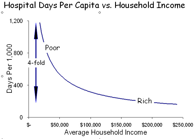
The most powerful characteristic associated with wellness, mortality and health care utilization is income. Low-income patients are sicker, die earlier and consume 2-4 times as much health care as affluent patients. And, because income inequality is greater in the US than in any other developed country, the extremes are greatest in the US.
Aside from its devastating social consequences, these circumstances present a challenge for risk adjustment. While some factors associated with poverty are captured by measuring severity of illness and co-morbidities, others are not. Examples include the effects of a nurturing childhood, adequate education and language skills; the impact of a caring environment with adequate physical resources and available care-givers; access to grocery stores, medications and transportation; safe neighborhoods; racial equality; and myriad other elements of life that impact on wellness, disease and healing. Many are a direct consequence of low income. Others are manifestations of poor neighborhoods – “poverty ghettos.” All correlate generally with income, even though income is not a measure of wealth, particularly in retirement, nor does current income necessarily reflect childhood income, which impacts on lifelong health. Despite these limitations, income is the index of importance.
How, then, to correct for income? Survey studies, such as the Medical Expenditure Panel Survey, include specific information about personal income, but most do not. Some studies of Medicare patients include Social Security income, a poor surrogate for personal income. Most studies lack specific information and rely, instead, on ZIP code income; i.e., the average income of individuals or households within the ZIP code of residence.
There are approximately 43,000 ZIP codes in the US. If the population were dispersed equally, each would have 7,500 people, but ZIP code populations range from fewer than 100 to more than 50,000. Moreover, because ZIP codes are formulated around mail routes rather than sociodemographic characteristics, many include individuals with a range of incomes. The errors that result from the use of ZIP code income are of two types: 1) high-income ZIP codes that include low-income residents are seen as utilizing more health care resources than their average incomes would predict (the geographic error); and 2) low-income residents of ZIP codes that include high income residents are assumed to use fewer resources than their actual incomes would predict (the risk-adjustment error). These two errors confound individual risk adjustment (as in hospital comparisons) and geographic risk adjustment (as in studies of regional variation).

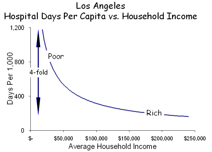
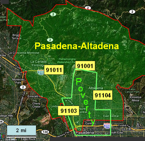
 Los Angeles is a case in point. While it possesses a dense poverty core and several affluent zones, it is a patch-quilt of wealth and poverty, often juxtaposed. The Pasadena-Altadena area is one patch in this quilt. A small concentration of poverty overlaps four adjacent ZIP codes, each with more than 20,000 people. In all, this area has 46,000 households with a median income of $60,000, but median incomes among the four ZIP codes range from $36,000 to $110,000, and individual households within them have incomes ranging from $10,000 to more than $1.0M. The utilization of hospital care also ranges widely among these ZIP codes, from 205 days per 1,000 in the wealthiest to 1,045 per 1,000 in the poorest.
How does the mix of affluence and poverty within ZIP codes affect the determinations of health care utilization? The figure below displays the income distribution in these four ZIP codes. From studies such as the graph above, we know that low-income households (shaded) contribute disproportionately to utilization and that utilization increases steeply at the lowest incomes. In contrast, high-income households contribute much less to utilization but contribute strongly to determining income.
The figure below illustrates the distribution of income in the four ZIP codes and indicates their average levels of hospital utilization. Utilization is influenced most strongly by the low-income households. Conversely, median incomes are influenced most strongly by high-income households. ZIP codes containing such mixtures of affluence and poverty form the “elbow” in the graph at the top. In ZIP 91011, which is predominantly high-income, the smaller proportion of low-income households contributes little to median income but disproportionately to average utilization. Only in ZIP 91003, with its predominance of low-income households, can a valid comparison be made between income and utilization. The consistent error is that utilization appears to be greater relative to income when higher-income ZIP codes include appreciable numbers of poor households. Aggregating and averaging such ZIP codes into hospital referral regions, as occurs in the Dartmouth Atlas, magnifies the error. In this way, affluent regions that include pockets of poverty, as most urban areas do, appear to use excessive resources, and because outcomes among the poor are poor, these resources are seen as “wasted.”

Risk adjustment is affected in the opposite direction. Because of where they live, low-income patients are assumed to have higher incomes than they actually have, sometimes very high, and adjustments that are based on their assumed incomes fail to fully account for the added risk among low-income patients. This phenomenon is clear in the figure above. Depending on their ZIP code of residence, patients with low incomes will be viewed as wealthy, middle income or poor, and their “adjusted” utilization will be determined accordingly. The result is that, by under-correcting for risk associated with low income, hospitals that care for the poor are seen as “wasteful.”
These vagaries of household incomes within ZIPs cast a shadow over geographic comparisons of health care utilization and outcomes, and they raise serious concerns about risk adjustment applied to individual patients. It is important, therefore, to examine ZIP codes to determine whether what they report about geographic variation is valid and, if not, to modify the analyses accordingly. No such remedy other than actual knowledge of patients’ incomes exists for risk adjusting individual patient experiences. ZIP code income is simply not a valid estimate. Hospitals that employ such an metric, as most must, will over-estimate income for poor patients and under-adjust for risk.
Poverty and Health Care: Getting Attention on the Web
Readers interested in the relationships between health care and poverty will want to read several new postings on the Web.
One is an article about my Rhoades Lecture (view slides here) given to the Medical Society in Detroit. It’s entitled “Poverty and Health Care in America.”
Second is by James Marks, MD, MPH, Vice President of the Robert Wood Johnson Foundation, entitled “The Poor Feel Poorly.” It is posted on the Huffington Post site.
Third is “Health and Health Care in America’s Poorest City,” a tragic and dramatic portrayal of America’s failures to its own in Detroit.
Finally, here is a link to a collection of papers on social inequalities in health by the McArthur Network on SES and Health, published by the New York Academy of Sciences under the title, “Biology of Disadvantage.”
