Category: Uncategorized
Dartmouth Strikes Again
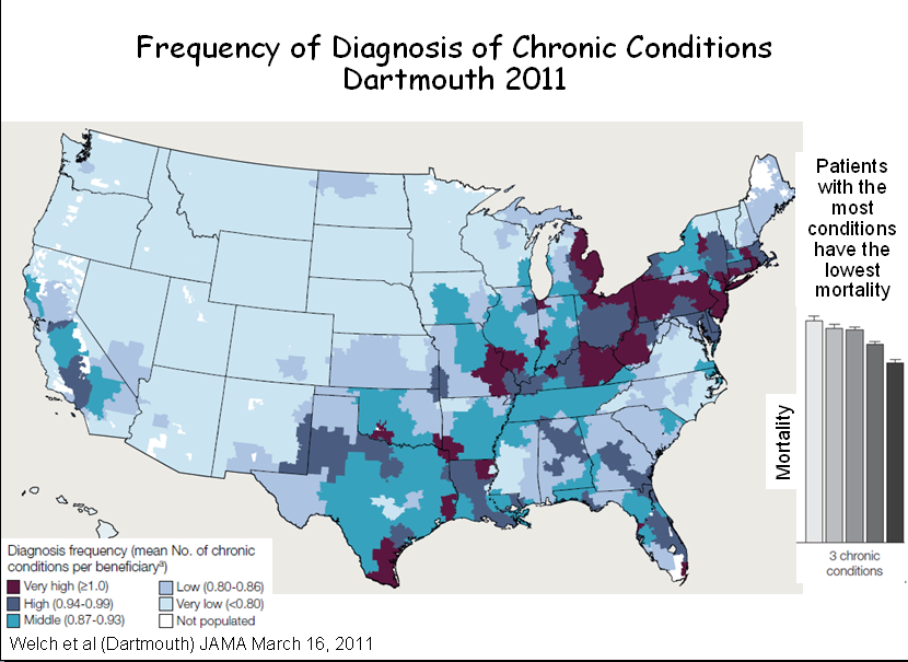
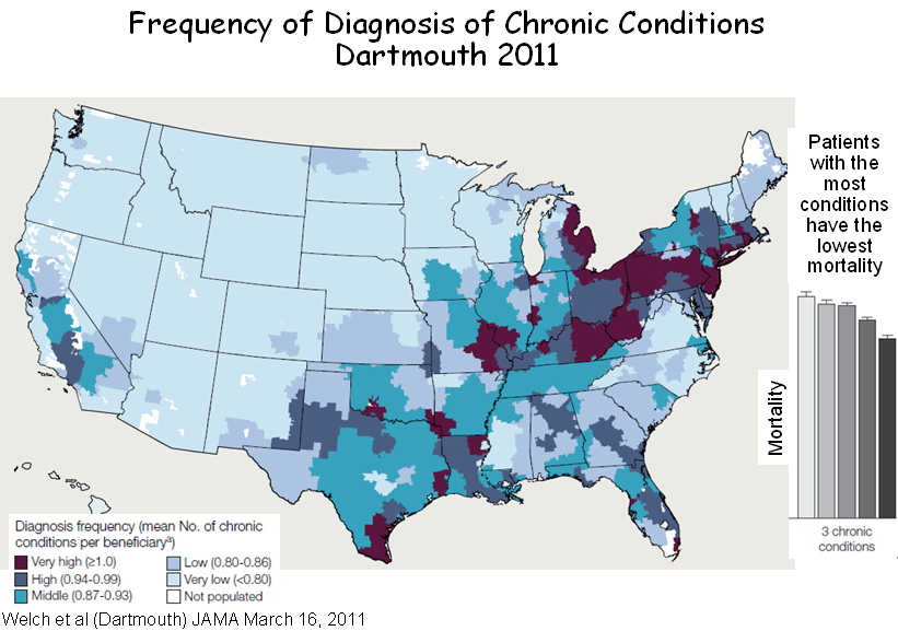
In a new article in the March 16th issue of JAMA, the Dartmouth team once again proves that what is not so is so. The BLUE map below is from their paper. It shows hospital referral regions (HRRs) where Medicare enrollees have the most diagnoses per enrollee. The little bar graph next to it shows that the quintile of HRRs where patients have the most diagnoses have the lowest mortality. A bit counter-intuitive. But the RED map (from the CDC) shows that most HRRs where patients have more diagnoses, and presumably the lower mortality, are in the area of the nation were the CDC says patients have the highest age-adjusted mortality from heart disease. There are similar maps for mortality from stroke.

You be the judge. Are areas of the nation with the most chronic disease diagnoses really areas of lowest mortality? But watch out. Dartmouth statistics are quicker than the eye.
MedPAC, Poverty and Geographic Variation in Health Care
MedPAC has released another report in which they have tried to explain variation in health care utilization among metropolitan statistical areas (MSAs), of which there are approximately 400. MSAs more-or-less correspond to Dartmouth’s 306 hospital referral regions (HRRs), and the conclusions reached by the Dartmouth folks and MedPAC tend to correspond. In commenting about MedPAC’s last report, issued in December 2009, I noted that the major variation was caused by high Medicare expenditures in seven southern states, where patients are poorer and sicker and use much more care.
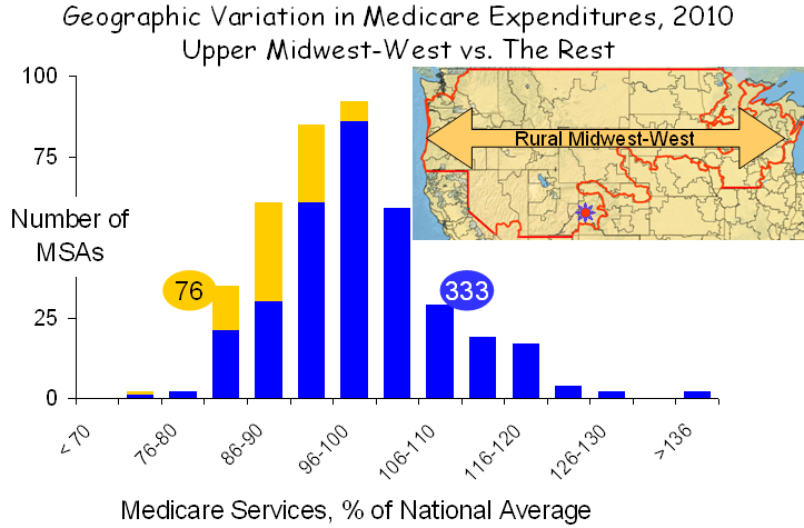
In their new report, MedPAC went a step beyond measuring expenditures, which they adjusted for prices and other factors in their last report, to measuring the actual units of service, a far better way to assess the health care system. MedPAC’s new findings on the distribution of service use in MSAs are graphed below:

Based on this new approach, MedPAC concluded, “although service use varies less than spending, the amount of service provided to beneficiaries still varies substantially. Specifically, service use in higher use areas (90th percentile) is 30 percent greater than in lower use areas (10th percentile); the analogous figure for spending is about 55 percent. What policies should be pursued in light of these findings is beyond the scope of this paper, which is meant only to inform policymakers on the nature and extent of regional variation in Medicare service use. However, we do note that at the extremes, there is nearly a two-fold difference between the MSA with the greatest service use and the MSA with the least.”
As with their previous analysis, the variation seen in their new graph is largely explained poverty and related social circumstances. If the goal is to reduce variation, then patients’ poverty, not physicians’ practices, must be the object of efforts, not that improvements in the way we practice are not warranted. They are, and more must be done, but the metric is not geographic. Poverty is the principle determinant of geographic variation.
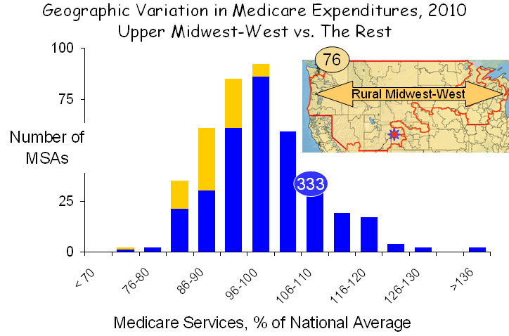
The profound contributions of poverty are exemplified by examining two distinct areas of the nation with diametrically opposite characteristics. The first, shown below, is the rural Midwest and west, which extends from Washington and Oregon in the west to Lake Michigan in the east and from the Canadian border to the southern edges of Utah and Nebraska.
 This region covers 30% of the land mass of the US but encompasses only 6% of the total population. Its demographics are unusual. Only 0.5% of the population is African-American, compared with 14% elsewhere, and only 10% are Latino, compared with 18% elsewhere. And while poverty exists in the rural Midwest and west, it exists at a much lower rate and rarely exists in anything resembling a poverty ghetto, as it does in major metropolitan areas. Although it covers a vast area, the rural Midwest-west has only 76 MSAs, and given their favorable demographics, service use in these MSAs was low.
It should be noted that this region became famous for being home to Grand Junction Colorado, designated in the figure above by the small red sun near the bottom of the illustration. President Obama held Grand Junction out as a model of health care because of its low spending, but on closer inspection this much-hyped conclusion proved to be nothing but a grand deception, as I recently discussed on this blog. Grand Junction is like the rest of the rural Midwest-west: white, middle class or more and low disease burden.
A second region of the country presents a very different picture. It is the “southern seven,” shown in red below. I described the characteristics of these states in my previous analysis of MedPAC’s 2009 data. Poverty is the highest in the nation, minorities comprise a larger portion of the population than elsewhere in the nation and the utilization of health care services is the greatest in the nation. While there are questions about fraud and abuse, as well, particularly in Florida, their most distinctive characteristic is poverty, and that is the major cause of high health care utilization.

Striping away the rural Midwest-west and the southern seven from the entire set of MSAs leaves 239, 60% of the total, which display very little geographic variation, as shown in the figure below. In fact, service use is greater than 10% above the mean in only two MSAs.

The picture that emerges is clear and unambiguous. More poverty in the south and less in the rural Midwest and west is the principal factor governing the observed geographic differences in service use. If that is true, there also should be a statistical relationship between the prevalence of poverty in various MSAs and the amount of care utilized by Medicare beneficiaries living there, and, as shown in the figure below, there is.

Across the full set of MSAs, there is a strong correlation between the amount of health care utilized, as measured by MedPAC, and the percent of seniors who are below the poverty line, as reported by the Census Bureau. Given the large populations of MSAs (averaging almost 1.0 million people) and their diverse physical configurations and social circumstances, it is remarkable that poverty proved to be such a strong correlate of the use of medical services, but that simply reflects the strength of the association between poverty and health care.
An interesting byproduct of this analysis was the observation that the three MSAs with the very highest levels of poverty and also very high levels of health care utilization were Laredo, Brownsville and McAllen Texas, which Gawande made famous by claiming that there was no relationship between their health care high utilization and poverty or other patient factors. But of course there is. Just as Dan Gilden said – the reason for high use in McAllen is its high burden of disease, which is a product of its high burden of poverty.
MedPAC, the IOM and countless other organizations are on a quest to explain geographic variation in health care. Yet the puzzle has been solved, and it is solved again here. Geographic variation in health care is a manifestation of geographic variation in poverty. The logic is obvious to all of us in our every day experiences. Poverty is associated with more disease, and poor people cope with disease more poorly. And poverty is geographic. So it should not be surprising that health care utilization and spending are geographic.
I believe it is time to stop looking for imaginary causes of geographic variation, or even worse, finding imaginary causes and constructing destructive policy based on them. Rather, it is time to recognize that the major underlying factor is poverty and its myriad social extensions. Effort would be better directed toward trying to understand how to better help poor people to cope better. And more than that, they should be directed to doing what is necessary to decrease the poverty in our society. More than the deficit, more than the war, poverty is our greatest challenge.
Myth and Reality in the Mountains of Colorado
By Buz Cooper, posted November 21 on the WSWS Web site, together with an introduction by Joanne Laurier and an interview with a Grand Junction resident. Also see Grand Deception at Grand Junction.
Grand Junction, Colorado, has emerged as the “poster child” for family practice. It was catapulted into this role when some folk were rummaging through the Dartmouth Atlas of Health Care and found that it has the 23rd lowest Medicare expenditures per enrollee. Why not Dubuque, Iowa, which is the 3rd lowest? Like Grand Junction, Dubuque has very few disadvantaged minorities and very little poverty. But it lacks something that Grand Junction has. The majority of primary care physicians in Grand Junction are family physicians, while the majority in Dubuque are internists and pediatricians.
And so begins the tale. It led to the Atul Gawande piece in the New Yorker [The cost conundrum, June 1, 2009], which President Barack Obama so admired, and that led the president to Grand Junction, which he admired even more. Speaking there as health care reform was being debated in Congress, Obama said,
“Hello, Grand Junction! It’s great to be back in Southwest Colorado. Here in Grand Junction, you know that lowering costs is possible if you put in place smarter incentives; if you think about how to treat people, not just illnesses; if you look at problems facing not just one hospital or physician, but the many system-wide problems that are shared. That’s what the medical community in this city did; now you are getting better results while wasting less money.”
The tale ends, at least for now, in a paper in the New England Journal of Medicine last month, in which Tom Bodenheimer and David West proclaimed Grand Junction’s family practice-dominated health care as the model for the nation, concluding with a reminder best summed up as “pay us more.”
The sad part of this tale is that there is a very important reason that some areas of the nation spend less on health care than others, and they have nothing to do with primary care or any care. They have to do with poverty. Folks who are poor are generally sicker, and while the Dartmouth Doubletalk machine would have you believe otherwise, patients who are sicker and poorer use more medical care. So the real message from Grand Junction is that if your community is white and middle class, health care costs will be low, but if many of your neighbors are poor and disadvantaged, be prepared to pay more.

Geography and Demography: Grand Junction is the gateway to a broad swath of America that I call the Rural Upper Midwest-West (RUMW), which extends from Washington and Oregon to the western shore of Lake Michigan, skirting around urban areas that lie at its periphery, such as Seattle, Denver, Omaha, Minneapolis and Milwaukee. It covers 30 percent of the land mass of the US but has only 7 percent of the Medicare enrollees and 6 percent of the total population. It also has very few ethnic minorities: 0.5 percent are African-American, compared with 14 percent elsewhere, and 10 percent are Latino, compared with 18 percent elsewhere. And while poverty exists in the RUMW, it exists at a much lower rate and not in poverty ghettos.
Utilization and outcomes in the RUMW. On average, Medicare patients in the RUMW use 25-30 percent fewer services. On a per capita basis, hospital bed capacity and nursing supply are similar to elsewhere in the nation, but there are 4 percent fewer physicians, more of whom are primary care physicians, especially family physicians. When gauged against health outcomes, this appears to be more circumstantial than causative. As assessed by the University of Wisconsin Population Health Institute, the RUMW has a more favorable panel of “health factors” (socioeconomic, behavioral, environmental and health system-related) and better measures of “health outcomes” (morbidity and mortality), and these two metrics correlate strongly with each other.
Health care in the Grand Junction HRR. The RUMW includes 43 of the 306 Hospital Referral Regions (HRRs) that make up the Dartmouth Atlas, as shown in the accompanying map. The Grand Junction HRR (population = 238,000) includes all or part of 10 counties, one of which is Mesa County (population = 146,000), which includes the city of Grand Junction (population = 58,000). The various descriptions of Grand Junction freely draw on these various units of analysis.
The Grand Junction HRR is very similar to the rest of the RUMW. By Dartmouth’s measure, it is near the middle, with lower spending in 17 and higher in 25. Grand Junction’s Medicare spending in is 98.5 percent of the RUMW average.
Most HRRs with lower spending are also within the RUMW. Indeed, only five are beyond its borders—Honolulu, Binghamton, New York, Lynchburg and Newport News, Virginia, and Albany, Georgia, but Albany is among these only because it fails to provide needed care; its mortality rate is 25 percent higher that average. Even those HRRs with slightly higher spending than Grand Junction’s are mostly in the RUMW. This includes 10 of the 19 HRRs where spending is no more than 5 percent higher. Clearly, there is something special about the RUMW, and one need only look at the demographics to figure out what that is.
Primary care. Much of the focus on the RUMW has to do with primary care. Overall, it isn’t much different than in the rest of the country. On a per capita basis, it has 4 percent fewer physicians and 4 percent more primary care physicians. But there is one big difference. More than 50 percent of the primary care physicians in the RUMW are family physicians, whereas, on average, there are fewer than 40 percent elsewhere in the US.
This is Family Practice Land. It’s where family practice succeeded in establishing training programs in the 1970s, while hospitals in the Northeast fended it off. It’s how Barbara Starfield was able to find an association between lower mortality and more “primary care,” but only family practice, not internal medicine or pediatrics. And it’s what led the Family Practice Academy to tout Grand Junction, where 60 percent of primary care physicians are family physicians. Although some parts of the RUMW have even more, like Appleton, Wisconsin, with 65 percent and both Sioux Falls, South Dakota and Casper, Wyoming, with 70 percent, Grand Junction became the poster child for family practice.
Grand Junction. So what do we know about Grand Junction? We know that it is family practice-dominated, that its demographics favor low health care spending, and that Medicare spending is low. In these ways, it resembles the rest of the RUMW. But there are several differences.
One is that, unlike the norm throughout the RUMW, Grand Junction does not have fewer physicians; it has more—18 percent more primary care physicians and 18 percent more specialists.
Second, Grand Junction has fewer long hospital stays and more hospice care, three times as much as elsewhere in the RUMW, although total utilization for out-of-hospital care, including skilled nursing and home care, is actually 10 percent greater than in the rest of the RUMW.
And finally, Grand Junction is rapidly growing. For the past 20 years, it has grown about 4 percent per year (four times the national average), which makes it one of the nation’s most rapidly growing communities in the RUMW and the nation. It also has a disproportionate supply of retirement communities, about half of which are for “active” retirees, which contributes to the fact that 15 percent of its population is Medicare-eligible, compared to 10 percent in Colorado and 9 percent nationally.
Grand Junction’s risks and outcomes. Mesa County’s mortality rate is 72 percent of the national average. Its health status is superior to other counties in the US in 15 of 19 measures, and it is similarly superior to a group of 26 counties that the US Department of Health and Human Services has identified as Mesa County’s “peers,” based on population, age distribution, poverty and frontier status.
According to the University of Wisconsin’s county ranking system, the “health factors” and “health outcomes” rankings in Mesa County are equivalent, indicating that outcomes reflect risk, and similar equivalency between rankings exists for all of the Grand Junction HRR. And while Medicare expenditures in the counties that comprise the Grand Junction HRR are in the lowest two quintiles when unadjusted, they are in the third and fourth quintiles when adjusted for various risk factors by researchers at Texas A&M.
Taken together, these findings indicate that Grand Junction’s better outcomes reflect its better health status, and its costs, although lower because risk is lower, are somewhat higher than would be expected for the demographic and health status risks that it has. In all, it is rather average.
This conclusion stands in stark contrast to the conclusion in the September 2010 issue of Health Affairs that Grand Junction has “a superior health system.” In support, Marsha Thorson and her colleagues in Grand Junction presented their comparison of mortality and readmission after hospitalization for heart failure, pneumonia or myocardial infarction at Grand Junction’s only hospital and 20 comparison hospitals. They found that Medicare patients in Grand Junction had fewer hospitalizations, shorter hospitalizations and lower mortality rates than patients in the comparison hospitals.
The accompanying graphics were rather convincing. But one important detail was omitted. What were the comparison hospitals? It was odd that such information was not provided. But the paper did note that these hospitals were in Colorado, New Mexico and New Jersey, and with some much appreciated help from the authors, I was able to determine that these 20 comparison hospitals were located in four clusters of 10 counties. Some of the details, along with those for Mesa County, are in the accompanying table.

Two hospitals were in northwest New Mexico, where 50 percent of the population is Native American and the poverty rate approaches 30 percent. A second group was in the Denver region, with its large Latino population. The third was in the Newark area, with its large African-American population and dense poverty. And the fourth was in two wealthy counties along the New Jersey shore.
When all 20 of these comparison hospitals were averaged, the good outcomes among affluent patients on the Jersey Shore were overwhelmed by the poor outcomes among ethnic minorities in Newark, Denver and northwest New Mexico, which made Mesa (Grand Junction) look exceptional. As they say, figures don’t lie….
There may be merit to the way physicians practice in Grand Junction, but there is no evidence that they achieve superior outcomes or lower costs than the rest of the RUMW. Nor are their outcomes better than expected on the basis of health factors. But there’s one thing I have not touched upon. The folks in Grand Junction are satisfied. They are proud of their system. And for good reason. Grand Junction has the luxury of an abundant supply of physicians. Indeed, to make that same supply available everywhere in the US would require 80,000 additional physicians. And that’s using Grand Junction, a low-risk community, as the standard. To bring all communities to Grand Junction’s level on a risk-adjusted basis would take twice that number, or more.
So I’m happy that Grand Junction is happy. I just wish they would stop misrepresenting what goes on there and allow the rest of the nation to confront its terrible problems of too much poverty and too few resources.
Tax Loopholes and Health Care Incentives
Deficit fixers are stumbling into the realization that our current problems are caused by too little economic growth, coupled with tax policy that is riddled with loopholes. These loopholes lead to counter-productive incentives, as taxpayers and businesses game the system to save money, often in ways that harm economic growth.
Now let’s look at health care reform. It, too, needs economic growth, not only to generate the revenues that pays for health care but to create jobs, which result in healthier workers and families. But like tax policy, health care reform is riddled with reimbursement incentives that drive counterproductive behavior. So the answer for both is the same. Grow the economy and simplify the flow of dollars through taxation and reimbursement.
The reason that tax loopholes are counterproductive is obvious, or usually so. But why might reimbursement incentives be counterproductive? The answer is that they are linked to lowering costs and higher quality. How could goals as desirable as these be counterproductive? The answer is that there are two separate reasons for higher costs and lower quality. One, which the incentives are directed toward, relates to the way we practice. The other relates to our patients’ socioeconomic status and family circumstances. From everything I know, the way we practice accounts for 20% and the sociodemographics of our patients account for 80%, which is the same as the relative contributions of schools and teachers vs. students and their families to the outcomes of education. And therein lays the problem of unintended consequences. A hospital or practice could improve its cost/quality profile and achieve higher reimbursement by changing what it does. But it could do even better by changing who it treats.
So, what happens? Hospitals down-size in the inner city and move to the suburbs. Patients who break the rules, for example by going to an emergency room at night, are dropped from plans. Office hours are limited to daytime when the working-poor can’t bring family members. Hospital emergency rooms close to police emergencies by keeping their ICUs filled. Patients are prematurely discharged to home situations that can’t properly care for them. And the list goes on. The best way to improve a bushel of apples is to throw out the bad ones.
But that’s only half the problem. By not recognizing the large impact of poverty on costs and quality, the special needs of the poor are not addressed and income inequality is allowed to grow. And by attributing poor outcomes to poor practices alone, the “Quality-Industrial Complex” flourishes and, in its zeal, denies the reality of poverty. And the cycle of failed policy goes on. That need not happen.
Bowles and Simpson Through The Looking Glass
The Bowles-Simpson deficit-reduction plan proposes to cut two-thirds out of Medicare’s payments for graduate medical education and to reduce Medicare spending through payment reform. Sound familiar? It should. These proposals are right from the Dartmouth-Orszag play-book. They flow from the mythology that, since 30% of health care spending is wasted due to the overuse of supply-sensitive services by unneeded specialists, we need fewer of them but more primary care physicians, and since health care spending is out of control, we need payment incentives that will improve efficiency and reward quality rather than quantity. What is not generally acknowledged is that changes like these penalize the urban-North and rural-South, where too many live in poverty. And the deep cuts proposed for disproportionate share (DSH) payments will harm them more. While more severe than some, these proposals are not new. They have been broadly embraced by many prominent entities engaged in health planning. Get used to it. You’re through the looking glass. The future is the past.
Poverty, Primary Care and Mortality: The View from Across the Pond
It is an article of faith that, in Barbara Starfield’s words, adults whose regular source of care is a primary-care physician rather than a specialist have lower mortality, even after accounting for differences in income, and she draws upon studies at both the county and state levels to prove it. Now a new paper in JAMA about England’s Primary Care Trusts refocuses the discussion on poverty.
While Starfield’s county-level studies are often cited as evidence that more primary care physicians and fewer specialists lead to lower mortality, they actually showed virtually no differences at all. And when repeated by Ricketts, the small differences noted were not consistent throughout various regions of the US. On the other hand, “counties with high income-inequality experienced much higher mortality.” So, in reality, the county studies demonstrated the strong impact of poverty and the marginal impact (if any) of primary care.
But there is a problem associated with measuring the association between physicians and mortality among counties. Patients in one county often receive care from physicians in another. This same limitation does not hold for measuring the association between income and mortality. They are both measured in the same person, who is in the same place.
States offer the opportunity to collect physicians and patients within units that generally include both, although the large size of states poses other limitations. In examining the effect of primary care at the state level, Starfield found that more primary care physicians were also associated with lower mortality, but that was true only for family physicians. More internists and pediatricians offered no such advantage. However, as in her county studies, she also found a strong association between greater income-inequality and higher all-cause mortality.
Why was the association of lower mortality and more primary care physicians limited to family practice? The answer is that family physicians are mostly in the upper-Midwest, where there are few blacks (whose mortality is double that of whites) and even fewer poverty ghettos (where mortality is greatest). The east and south, which have plenty of both, have preferred internists. The association of more “primary care” (aka, family practice) with lower mortality is a geographic artifact. Indeed, there is an even stronger association between lower mortality and more snow!
In this week’s JAMA, Levene and his colleagues have reported their study of variation in mortality among England’s 152 Primary Care Trusts, which, of course, collect patients and physicians together. They found that the strongest predictors were socioeconomic deprivation, race, smoking and diabetes. Neither the number nor the clinical performance of primary care providers predicted mortality.
The consistent theme is that poverty matters and primary care does not, at least for mortality. But everyone knows that primary care matters anyway, and so does specialty care. And both function better when they work together, and they function best when there are sufficient numbers of both kinds of providers. Yet, we are on a path toward increasing shortages across the board.
Health care reform is off the track for many reasons, not the least of which is that the role of primary care has been so misrepresented and the drive to denigrate specialists has been so vigorous. The tasks at hand is to end the “verbal propaganda” that has so divided disciplines and concentrate on assuring that the supply of physicians and other advanced health care professionals, both specialists and PCPs, will be sufficient for the future. And the broader task is to build the social infrastructure of housing, education and more that allows the poor to function and stops the cycle of poverty that plagues America.
Grand Deception at Grand Junction
In a high-profile paper in the September issue of Health Affairs, Thorson and coworkers showed that the care at St. Mary’s Hospital in Grand Junction, CO was superior to that of 20 other unnamed hospitals. Grand Junction is, of course the small town in SW Colorado that became famous when President Obama visited there during the summer of 2009, and here’s what he said:
“Hello, Grand Junction! It’s great to be back in Southwest Colorado. Here in Grand Junction, you know that lowering costs is possible if you put in place smarter incentives; if you think about how to treat people, not just illnesses. That’s what the medical community in this city did; now you are getting better results while wasting less money.”
So, Grand Junction, a town of 58,000 people located in SE Colorado, where there are virtually no blacks and fewer Native Americans but where Family Practice rules, is supposed to be the model for the nation.
It’s rather astounding that Health Affairs would have published this paper without identifying the 20 “comparison” hospitals that make Grand Junction look so good. However, it did say that they were in Colorado, New Mexico and New Jersey, and with some much appreciated help from the authors, I’ve been able to identify the actual counties where these 20 hospitals are located. It turns out that they are clustered in four regions. Here they are, along with Mesa County, where Grand Junction is located: When the top four are averaged, the good outcomes along the Jersey Shore can’t quite balance the poor outcomes among ethnic minorities in Newark and Denver and 0n Indian reservations in NW New Mexico, so the average is not good, which makes Mesa (Grand Junction) look terrific. But if only the Jersey Shore counties are compared with Mesa (Grand Junction), the Jersey Shore wins by 22 percentage points on the county health rankings. And when Mesa (Grand Junction) is compared with the 26 counties that have been identified as its “peers” by the government’s Community Health Status Indicators (CHSI) Web site, Mesa (Grand Junction) is dead average – identical in outcomes to its peers, none of which have Family Practice-dominated health care.
Let’s be honest, folks. Lake Wo-be-Junction is like lots of other places with few ethnic minorities and not much poverty. So let’s end the Grand Deception about Grand Junction and recognize that the major reason that communities vary in health care outcomes is that they vary in socioeconomic status. The failure to address this head is what led to the vodoo economics of health care reform, which already have cost the President a loss at the polls and are costing poor Americans a lot more.
Orszag: The Death of Geographic Variation, the Birth of Uneven Distribution
November 2007 – New England Journal of Medicine: “Embedded in the country’s fiscal challenge is the opportunity to reduce costs without impairing overall health outcomes. Perhaps the most compelling evidence of that opportunity lies in substantial differences in health care spending and the fact that higher-spending regions do not have higher life expectancies or show significant improvement on other measures of health.”
September 2008 – Stanford University: “We’ve got these huge variations in the utilization intensity of health care practices that are absolutely astonishing, which suggests that there is radical inefficiency in our health care system. The most compelling evidence is the very substantial variation in health care costs we see in different parts of the United States which the Dartmouth group has not been able to explain based on underlying health characteristics of the patients in different areas. There is little evidence that the extra spending gets us anything in terms of reduced mortality or higher quality.”
December 2008 – CBO Report: “In sum, the evidence about variation in spending suggests that efficiency gains in the health care system are possible: Expenditures in high-spending regions could probably be lowered without producing worse outcomes, on average, or reducing the overall quality of care.”
May 2009 – Wall Street Journal: “Medicare enrollees in areas with higher spending do not appear to have better health outcomes on average than those in areas with lower spending. If we can move our nation toward the proven and successful practices adopted by lower-cost areas and hospitals, some economists believe health-care costs could be reduced by 30% — or about $700 billion a year — without compromising the quality of care.”
May 2009 – National Public Radio: “Estimates suggest that as much as $700 billion a year in health care costs do not improve health outcomes. It occurs because we pay for more care rather than better care.”
(And now the Wizard of Orszag does his Geographic Variation disappearing act. Watch….)
August 2010 – New England Journal of Medicine: “Yet ‘bending the curve’ of health care inflation also requires a more direct challenge in the way that health care is delivered. Health care costs are unevenly distributed: 10% of patients account for 64% of costs. Sustained cost control will occur only with more coordinated care that prevents avoidable complications.”
To the Wizard of Orszag: Poverty explained geographic variation, so it’s no longer “unexplained,” and poverty accounts much of the uneven distribution of costs. Health care cannot be reformed without addressing P-O-V-E-R-T-Y.
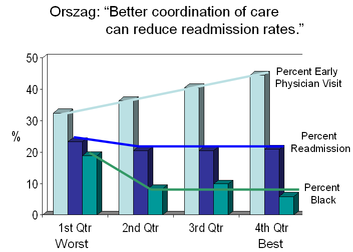
The Wizard of Orszag on Readmissions
On the 71st anniversary of “The Wizard of Oz,” Peter Orszag, the wizard of health care reform, returned to the pages of the NEJM, this time to tell the wonderfulness of his Affordable Care Act. One of its great features is that it will penalize hospitals with excessive readmission rates, easily avoidable by simply assuring that patients have a physician visit quickly upon discharge since, according to a paper that he quotes from a recent JAMA, early follow-up reduces readmissions. So I read the paper and summarized it in the bar graph below. What it shows is that there is no difference in readmissions among hospitals in the three highest quartiles of follow-up visits, despite a substantial decline in follow-up among them. Only the lowest quartile of hospitals has more readmissions. Also, there’s no difference in the percent of blacks at the hospitals in the three highest quartiles for follow-up. Only the lowest quartile has more blacks – by double. So there’s no gradient that links follow-up to readmissions, but there is a distinctive quality about the hospitals with more readmisions – more blacks, which really means more poverty. Follow the yellow brick road. It leads to poverty. Penalizing hospitals that take care of the poor and therefore have more readmissions certainly will not help.
Intersecting Fault Lines – Health Care, Finance and Poverty
Solutions to problems are generally sought from within the problems themselves. Two recent examples are health care and finance. In both cases, the solutions are believed to be better-structured and regulated systems. In blogs, articles and speeches, I have stressed that, while there are myriad ways that health care can be improved, the real solutions to high health care spending lie outside of health care. Poverty and its associated manifestations are at the core of the health care spending crisis. The high costs of caring for the poor will continue to overwhelm the system, no matter how it is structured and improved. Rather than looking for solutions through changes in process and regulation, the major solutions to health care’s excessive spending reside in areas such as K-12 education, neighborhood safety and the creation of jobs that can lift low-income families from the cycle of poverty. Simply stated, the US does not and will not have the resources to provide equitable care for those among us who confront inequitable circumstances in every other aspect of their lives.
Now Raghuram Rajan, a distinguished professor of finance at the University of Chicago and former chief economist at the IMF, has come to the same conclusion about our financial system. In his new book, Fault Lines: How Hidden Fractures Still Threaten the World Economy, he describes how cheap credit was a mistaken remedy for the consequences of poverty. In addressing its financial future, the US will have to place greater emphasis on educating its young and creating a safety net for its poor.
Neither cheap credit for those who are too poor to pay it back nor costly health care for those whose poverty creates the demand for more, nor even more primary care physicians to treat their woes, can hold our society together. Commenting in the BMJ on similar circumstances in England, Iona Heath said, “It has been much too easy and much too convenient for governments to locate the task of lessening health inequalities within their health services, as if a brief contact with the health service could compensate for a lifetime of disadvantage and deprivation, with the resulting almost inevitable attenuation of opportunity and hope.” Here, as there, the fault lines of income inequality are the nation’s greatest challenge.
