
MedPAC, Poverty and Geographic Variation in Health Care
MedPAC has released another report in which they have tried to explain variation in health care utilization among metropolitan statistical areas (MSAs), of which there are approximately 400. MSAs more-or-less correspond to Dartmouth’s 306 hospital referral regions (HRRs), and the conclusions reached by the Dartmouth folks and MedPAC tend to correspond. In commenting about MedPAC’s last report, issued in December 2009, I noted that the major variation was caused by high Medicare expenditures in seven southern states, where patients are poorer and sicker and use much more care.
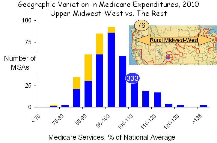
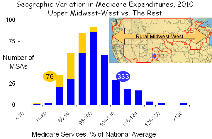
In their new report, MedPAC went a step beyond measuring expenditures, which they adjusted for prices and other factors in their last report, to measuring the actual units of service, a far better way to assess the health care system. MedPAC’s new findings on the distribution of service use in MSAs are graphed below:

Based on this new approach, MedPAC concluded, “although service use varies less than spending, the amount of service provided to beneficiaries still varies substantially. Specifically, service use in higher use areas (90th percentile) is 30 percent greater than in lower use areas (10th percentile); the analogous figure for spending is about 55 percent. What policies should be pursued in light of these findings is beyond the scope of this paper, which is meant only to inform policymakers on the nature and extent of regional variation in Medicare service use. However, we do note that at the extremes, there is nearly a two-fold difference between the MSA with the greatest service use and the MSA with the least.”
As with their previous analysis, the variation seen in their new graph is largely explained poverty and related social circumstances. If the goal is to reduce variation, then patients’ poverty, not physicians’ practices, must be the object of efforts, not that improvements in the way we practice are not warranted. They are, and more must be done, but the metric is not geographic. Poverty is the principle determinant of geographic variation.
The profound contributions of poverty are exemplified by examining two distinct areas of the nation with diametrically opposite characteristics. The first, shown below, is the rural Midwest and west, which extends from Washington and Oregon in the west to Lake Michigan in the east and from the Canadian border to the southern edges of Utah and Nebraska.
 This region covers 30% of the land mass of the US but encompasses only 6% of the total population. Its demographics are unusual. Only 0.5% of the population is African-American, compared with 14% elsewhere, and only 10% are Latino, compared with 18% elsewhere. And while poverty exists in the rural Midwest and west, it exists at a much lower rate and rarely exists in anything resembling a poverty ghetto, as it does in major metropolitan areas. Although it covers a vast area, the rural Midwest-west has only 76 MSAs, and given their favorable demographics, service use in these MSAs was low.
It should be noted that this region became famous for being home to Grand Junction Colorado, designated in the figure above by the small red sun near the bottom of the illustration. President Obama held Grand Junction out as a model of health care because of its low spending, but on closer inspection this much-hyped conclusion proved to be nothing but a grand deception, as I recently discussed on this blog. Grand Junction is like the rest of the rural Midwest-west: white, middle class or more and low disease burden.
A second region of the country presents a very different picture. It is the “southern seven,” shown in red below. I described the characteristics of these states in my previous analysis of MedPAC’s 2009 data. Poverty is the highest in the nation, minorities comprise a larger portion of the population than elsewhere in the nation and the utilization of health care services is the greatest in the nation. While there are questions about fraud and abuse, as well, particularly in Florida, their most distinctive characteristic is poverty, and that is the major cause of high health care utilization.

Striping away the rural Midwest-west and the southern seven from the entire set of MSAs leaves 239, 60% of the total, which display very little geographic variation, as shown in the figure below. In fact, service use is greater than 10% above the mean in only two MSAs.

The picture that emerges is clear and unambiguous. More poverty in the south and less in the rural Midwest and west is the principal factor governing the observed geographic differences in service use. If that is true, there also should be a statistical relationship between the prevalence of poverty in various MSAs and the amount of care utilized by Medicare beneficiaries living there, and, as shown in the figure below, there is.

Across the full set of MSAs, there is a strong correlation between the amount of health care utilized, as measured by MedPAC, and the percent of seniors who are below the poverty line, as reported by the Census Bureau. Given the large populations of MSAs (averaging almost 1.0 million people) and their diverse physical configurations and social circumstances, it is remarkable that poverty proved to be such a strong correlate of the use of medical services, but that simply reflects the strength of the association between poverty and health care.
An interesting byproduct of this analysis was the observation that the three MSAs with the very highest levels of poverty and also very high levels of health care utilization were Laredo, Brownsville and McAllen Texas, which Gawande made famous by claiming that there was no relationship between their health care high utilization and poverty or other patient factors. But of course there is. Just as Dan Gilden said – the reason for high use in McAllen is its high burden of disease, which is a product of its high burden of poverty.
MedPAC, the IOM and countless other organizations are on a quest to explain geographic variation in health care. Yet the puzzle has been solved, and it is solved again here. Geographic variation in health care is a manifestation of geographic variation in poverty. The logic is obvious to all of us in our every day experiences. Poverty is associated with more disease, and poor people cope with disease more poorly. And poverty is geographic. So it should not be surprising that health care utilization and spending are geographic.
I believe it is time to stop looking for imaginary causes of geographic variation, or even worse, finding imaginary causes and constructing destructive policy based on them. Rather, it is time to recognize that the major underlying factor is poverty and its myriad social extensions. Effort would be better directed toward trying to understand how to better help poor people to cope better. And more than that, they should be directed to doing what is necessary to decrease the poverty in our society. More than the deficit, more than the war, poverty is our greatest challenge.

I am pleased that I observed this web blog , just the right information that I was looking for! .