
Dartmouth Strikes Again
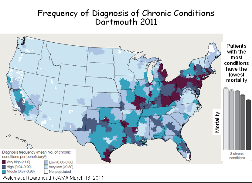
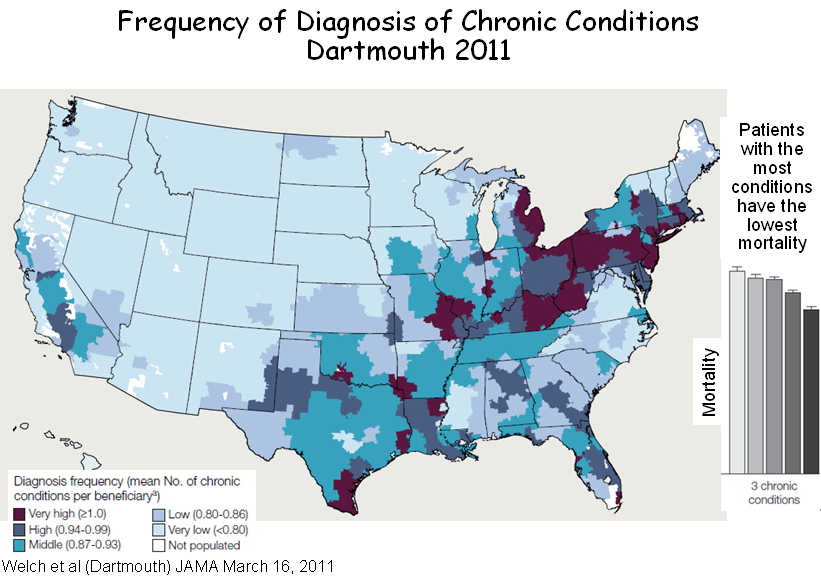
In a new article in the March 16th issue of JAMA, the Dartmouth team once again proves that what is not so is so. The BLUE map below is from their paper. It shows hospital referral regions (HRRs) where Medicare enrollees have the most diagnoses per enrollee. The little bar graph next to it shows that the quintile of HRRs where patients have the most diagnoses have the lowest mortality. A bit counter-intuitive. But the RED map (from the CDC) shows that most HRRs where patients have more diagnoses, and presumably the lower mortality, are in the area of the nation were the CDC says patients have the highest age-adjusted mortality from heart disease. There are similar maps for mortality from stroke.

You be the judge. Are areas of the nation with the most chronic disease diagnoses really areas of lowest mortality? But watch out. Dartmouth statistics are quicker than the eye.
