Category: Uncategorized
Dear Leader Reid and Speaker Pelosi,
Provisions in the Senate and House health care reform bills propose to reallocate resources based on geographic differences in Medicare spending. While well intended, they will penalize providers who care for the poor and impair access for these vulnerable patients.
A reallocation of resources to lower-cost states has been endorsed by members of Congress from states with lower Medicare spending who believe that, by receiving less from Medicare, their states are currently being penalized for being “efficient.” However, it is not efficiency that accounts for their lower spending. It is less poverty and better health status. 
The map shows (in blue) the ten states represented by members of Congress who have publicly endorsed reallocation plans based on geographic differences. Six neighboring states with similar characteristics are lightly shaded. On average, the Medicare spending in these 16 states is 20% less than in the rest of the country.
The “low-cost” states cover almost 40% of the land mass of the US but encompass only 14% of the population and only 3% of the African-American population. While they include many prominent cities, there are no major urban centers with the dense zones of poverty, as are found in Chicago, Los Angeles and New York. Nor are there broad bands of poverty, as are found in Louisiana, Mississippi, Alabama and southern Texas. Yet it is in “poverty ghettos” and broad “poverty regions” that health status is poorest and health care spending is greatest.
We must not confuse the added costs of caring for the poor with inefficiency in health care. The greatest “inefficiency” is poverty. The US will never slow the growth of health care spending unless it addresses the special needs of its most disadvantaged citizens. Health care reform should assist the hospitals and physicians who care for them. Unfortunately, a number of sections of the current bills do just the opposite.
Hospital readmissions. Section 3025 of the Senate bill (Hospital Readmissions Reduction Program) and its companion Section 1151 of the House bill (Reducing Potentially Preventable Hospital Readmissions) would penalize hospitals that have higher rates of readmissions. While increased rates may reflect substandard care in some hospitals, the more common reason for higher rates is more patients who have complex diseases processes and little social support, most of whom are poor. Indeed, when fully adjusted for severity of disease, most inter-hospital differences in readmission rates disappear.
Value and efficiency. Because providers in counties where poverty is prevalent have higher per-beneficiary spending, they would be classified as “inefficient” under Section 1123 of the House bill (Payments for Efficient Areas), while providers in the 20% of counties that have the lowest Medicare expenditures would receive a 5% bonus. In like manner, Section 3001 of the Senate bill (Hospital Value-Based Purchasing Program) would reward hospitals that have lower per-beneficiary costs for certain defined conditions (acute MI, congestive health failure, pneumonia, etc.), although it is known that expenditures for such conditions are much greater among low-income patients. I am hopeful that the Senate bill will not include the Finance Committee’s call for penalties for physicians whose resource use is in the highest decile, which would mainly affect those whose practices include poor patients with multiple comorbidities.
IOM study of geographic variation. The same logic pattern that has been applied to readmission policy and to “value-based purchasing” exists in Sections 1159 and 1160 of the House bill, which instructs the Institute of Medicine to develop payment policies based on geographic differences in health care, with the assumption that differences in the Dartmouth Atlas are relevant to cost containment. Yet MedPAC has shown that, even without adjusting for income, much of the variation disappears with adjustment for health status. But even though the bill instructs the IOM to consider income and other social determinants, there are no standards that can be applied nationally to adjust adequately for these factors. On the other hand, there are partial remedies for their effects, such as the wider use of interpreters and transitional care coordinators, as Section 1151(8) of the House bill proposes to support.
Efficiency and value are important goals, but variation in their geographic distribution is principally a reflection of variation in poverty and the prevalence of disease. That should not be a surprise. We all know that poverty varies geographically, and we know that the care of the poor is expensive. If health care costs are to be constrained, it must be through addressing the needs of low-income patients; not through penalizing the providers who care for them.
Respectfully,
New York Times: “UCLA Trumps Dartmouth”
When the New York switches sides, it’s probably true, and now, after years of extolling the virtues of Dartmouth’s geographic malarkey, the Times has published an article about the work conducted by Tom Rosenthal and his colleagues at UCLA and elsewhere in the U Cal system demonstrating that more care is not wasteful, as the Dartmouth-Orszag team professes. It saves lives, which is what health care is all about. Senators should take note before they vote on their historic bill, which will penalize hospitals and physicians who provide added care for patients who are sicker and often poorer. It’s not too late to do it right.
Shortened Lives: Where You Live Matters
Be sure to read the four-part series in the Oakland Tribune by Suzanne Bohan and Sandy Kleffman describing life and death in the Bay Area’s poorest ZIP Codes.
“Closing the gap in life expectancy between those perched on different rungs of the socioeconomic ladder isn’t just unfinished work in the Civil Rights Movement, health advocates say. It’s critical to controlling runaway health care costs.”
You can read more about this issue in other posts, particularly this, this and most recently this — and much more. It is the issue of our times.
Getting to the Core of Geographic Variation
On the heels of the American Hospital Association’s recent demonstration of gross discrepancies in the Dartmouth group’s data, MedPAC released its December 2009 report to Congress showing the same. Confirming data for 2000 (reported in their 2003 report), MedPAC demonstrated much less variation among states and metropolitan statistical areas (MSAs) than described by Dartmouth for states or hospital referral regions (HRRs). Closer scrutiny of MedPAC’s data reveals even more.

Adjustments. First, the Dartmouth group has claimed that they adjusted their measures of Medicare spending for age, sex, race, mortality, disease incidence and prices. But Dartmouth’s adjusted data are indistinguishable from MedPAC’s unadjusted data, both among states (in 2000) and HRRs (in 2006), as shown to the left. This confirms suspicions that Dartmouth’s “adjustments” are all shadows and mirrors, or just malarkey.
Adjusted variation. Second, as reported by MedPAC and consistent with the above, MedPAC found much less variation in Medicare spending among MSAs after adjusting for prices, health status and special payments than Dartmouth found among HRRs after supposedly adjusting for prices and a host of other factors. The two figures below demonstrate that. One need only look at the broadly dispersed bars in the illustration of Dartmouth variation and the more tightly packed ones in MedPAC’s.


Sociodemographic realities. But, despite finding much less geographic variation, MedPAC pointed out that there still was plenty. The greatest likelihood is that most of this residual variation is related to differences in income, which MedPAC does not account for (except as it correlates with health status).  The final graphic supports that view. It distinguishes a cluster of eight southern states, which house 89 MSAs, from the other forty states (Alaska and Hawaii were excluded), which house 312. Compared to the other forty, the “southern eight” has a poverty rate that is 55% higher (89% higher for blacks); its rate of uninsurance is 31% higher (89% higher for blacks); and its mortality rate is 16% higher (30% higher for blacks). Excluding the “southern eight,” Medicare spending is within 10% of the mean in 87% of the MSAs in the other forty states. Only five MSAs out of 312 fall beyond +15%.
While no one would deny that the practice of medicine varies among practitioners for a host of reasons, both good and bad, such variation is not responsible for geographic variation, or at least not usually. Rather, geographic variation in health care spending reflects geographic variation in prices and variation in two patient-related factors: income and burden of disease. As I said before, the Dartmouth Atlas is the “Wrong Map for Health Care Reform.” Getting to the core of geographic variation can help us get health care reform right.
Legislating to Reduce Readmissions – Bad Policy
According to MedPAC, 18% of hospitalizations among Medicare beneficiaries resulted in readmission within 30 days, accounting for $15 billion in spending. Since treatable chronic illnesses are responsible for many such hospitalizations, it is assumed that they represent failures of the health care system. MedPAC claims that 84% of readmissions are potentially preventable. However, as will become evident, most readmissions reflect differences in co-morbidities, poverty and other social determinants, all of which deserve attention, including better transition care, but few of which are under the control of hospitals. Nonetheless, health care reform assumes that regulators can accurately adjust for such risks and estimate the “excess.”
Both the House and Senate bills include reductions in payments to hospitals with “excess” readmissions. Payment would be reduced 20% for “excess” readmissions within seven days and 10% within fifteen days. Hospitals with 30-day risk-adjusted readmission rates above the 75th percentile would incur penalties of 10-20%, scaled to the time to readmission.
The legislation gives ultimate authority to the Secretary of Health to define national and hospital-specific benchmarks according to methodologies that would be determined by the Secretary and that would be free of administrative or judicial review.
So, just how many hospitals are over the threshold? The three illustrations below present the dilemma for one category of disease: congestive health failure. Each presents risk-adjusted data for more than 4,000 hospitals. MedPAC risk-adjusted using 3M’s “all patient refined diagnosis related groups” (APR-DRGs), a proprietary package that defines the severity of illness for 314 indications. CMS used their own statistical model that estimates the independent effects of age, gender, past medical history and approximately 40 comorbidities. The research group at Yale headed by Harlan Krumholz, the nation’s most prominent cardiac epidemiologist, used a hierarchical logistic regression model for patients with heart failure, drawing on age, gender, 26 comorbidity variables and 9 cardiovascular variables.

 All of the hospitals in the upper 25% as evaluated by MedPAC had readmission rates that were more than 2% above the mean, but that was true for only half of the hospitals as evaluated by CMS and for fewer than 10% of such hospitals as evaluated by the Krumholz group. Indeed, when CMS put its assessment to the statistical test, it found that, despite the wide variation depicted, only 5% of hospitals had readmission rates that were statistically “worse than the US average,” far short of the 25% that would be dunned.
This poor policy is a tragic manifestation of Dartmouth malarkey, which has created the false belief that reducing geographic variation could save enough to make health care reform possible – the “30% solution.” The result, instead, would be serious damage to hospitals that care for the most vulnerable patients, a large proportion of which are safety-net hospitals and academic medical centers, and that’s no way to reform health care.
Academic Medical Centers and the Poor
In a recent Health Affairs blog, Wennberg and Brownlee lamented that op-eds, blogs, letters to members of Congress, broadsides in the press and now a report from the American Hospital Association decry the Dartmouth Atlas as a lot of “malarkey.” Once again they tried to defend their work by proving that race and poverty don’t matter, but they do. Even the “impartial” introduction by the editor of Health Affairs, a member of Dartmouth’s Board, couldn’t save the day: “Wennberg and Brownlee rebut claims that variations among academic medical centers are due to differences in patient income, race, and health status.” Wrong, again! That’s exactly what variations are due to.
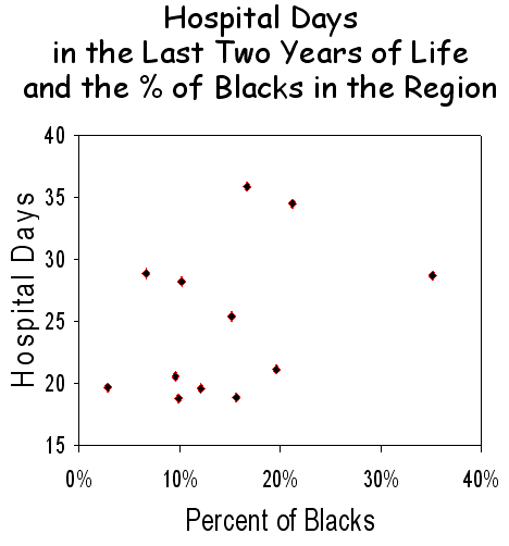
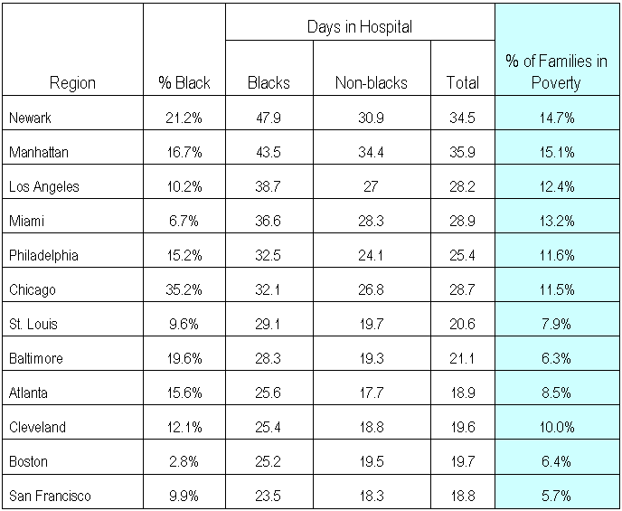
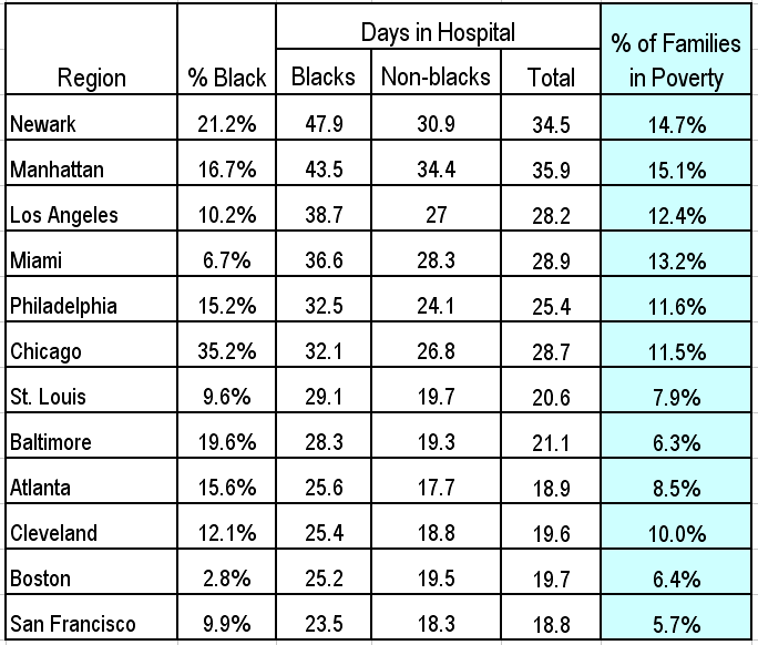
Black is not a measure of poverty. In the obtuse reasoning that characterizes the Dartmouth group, Wennberg and Brownlee’s first argument was that, although blacks utilized approximately 1/3 more care than non-blacks, the amount of care received during the last two years of life was greater in some communities than others for both black and non-black patients, and it didn’t correlate with how many blacks there were (see figure below). They concluded that “race and poverty do affect utilization. Where patients get their care matters far more than the size of their income or the color of their skin.”
The problem is that income, which is the strongest correlate of health care utilization, was not measured, and the only skin color that was measured was black, which is not a proxy for income. In fact, in many of the communities studied, the ethnic groups with the greatest poverty were Latino or Asian.
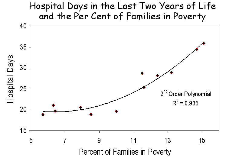
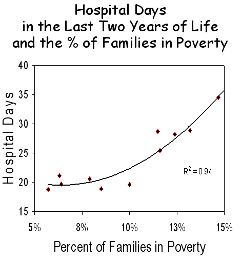
To directly examine income, Census Bureau data on family poverty were obtained for each of the communities Wennberg and Brownlee studied, and these data were plotted against their measures of the number of hospital days used in each community. A very strong correlation was observed (R2 = 0.94), and like previous examinations of the relationship between income and utilization, it best fit a 2nd order polynomial. The answer is clear. Poverty explains a great deal about the differences in health care utilization in various communities.
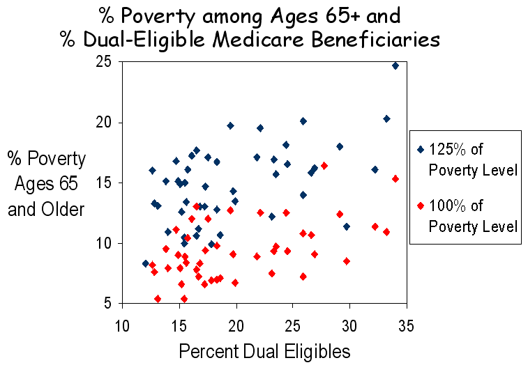
Dual eligibility is not a measure of poverty. Wennberg and Brownlee next assessed the potential role of poverty in a large group of academic medical centers. To do this, they examined the relationship between the number of hospital days used by Medicare beneficiaries during the last six months of life and the percent of patients in each hospital who were dually eligible for both Medicare and Medicaid, assuming that dual eligibility is a valid proxy for poverty. They found no relationship, which led them to conclude that poverty played no role. However, their fundamental assumption was incorrect. Although dual eligibles are poor, dual eligiblility is not a proxy for poverty, as is evident in the figure below.
Dual eligibles span a diverse array of income and disabilities. They tend to be in poorer health and, although they constitute fewer than 20% of enrollees, they consume more than 30% of resources. Under federal law, state Medicaid programs must cover elderly individuals who receive Supplemental Security Income (SSI) and disabled non-elderly individuals who meet specific and income requirements, although certain states are permitted to establish more restrictive criteria and all states may extend Medicaid coverage to broader groups of elderly and disabled. Income eligibility ranges from as low as 75% of the federal poverty level in some states to > 200% in others. Approximately one-third of dual eligibles are non-elderly patients with disabilities, including end stage renal disease (ESRD). Overall, the non-elderly disabled account for 15% of Medicare beneficiaries, but the percent varies two-fold among states. Together with poor elderly who meet the income eligibility criteria, 21% of Medicare beneficiaries are dually eligible, but this number varies from about 12% in some states to more than 30% in others.
Because of differences in eligibility and in the prevalence of disability, there is little uniformity in the characteristics of dual eligibles in the various states. Moreover, as shown in the illustration above, there is no relationship between the percent of dual eligibles in a state and the percent of seniors who are at the poverty level. Wennberg and Brownlee incorrectly assumed that dual eligiblility is a proxy for poverty. It is not. The lack of a relationship between the percent of beneficiaries who are dual eligible and overall health care utilization says nothing about poverty. Rather, the direct relationship between poverty and utilization in the example above and countless others speaks volumes.
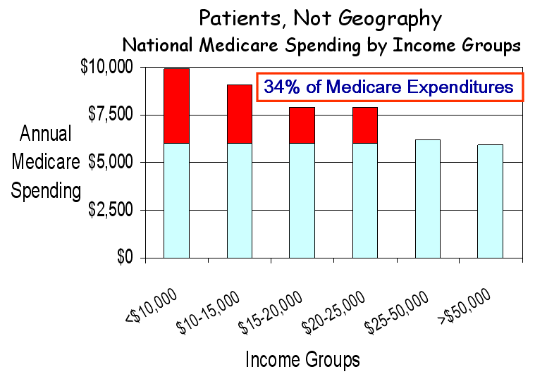
Poverty is a major factor in Medicare spending. In summarizing their remarks, Wennberg and Brownlee state that “a recent study published in the New England Journal of Medicine by some of our colleagues found that poverty and race had virtually no impact on utilization.” What this study actually showed was a strong relationship between poorer health status, greater spending and higher mortality, and it demonstrated a strong relationship between lower income and higher Medicare spending (figure below). In fact, if health care spending for all Medicare beneficiaries were at the same level as for those with annual incomes above $25,000, overall Medicare spending would be 34% less. So how does one account for the statement that poverty and race don’t matter? Their Dartmouth colleagues left the real data behind and retreated into their mythical world of “quintiles,” in which the nation’s hospital referral regions are grouped into five uqintiles based on their levels of Medicare spending. This brings together disparate geographic areas which, when aggregated and averaged, all regress to the mean, and nothing is different. It’s this same shell game that gave us the “30% solution,” but the shells have been turned over, and we now know that nothing is there. Thankfully, the poor have won. Poverty matters.
A challenge to Dartmouth. Wennberg and Brownlee ended their essay by pointing out that, “as guardians of the scientific basis of medical practice, academic medical centers have a special responsibility to understand why they treat similar patients differently.” Well, from everything I know, and from the vast and growing literature that supports it, the major reason for these differences is that their patients are different. This doesn’t mean that hospitals and physicians shouldn’t look for better ways to practice, even if they all practice the same. But it does mean that the differences that Wennberg and associates measure are principally related to poverty and other social determinants of disease. I would turn the challenge around: as self-proclaimed guardians of regional variation, it’s time for the Dartmouth group to stop spreading malarkey. They have a moral responsibility to do so.
Explaining McAllen – It’s Disease Burden
Gawande’s McAllen continues to reverberate throughout the Land of Orszag, which is home to health care reform, but I have been spending more time in the Land of Gilden, where reason abounds. Because you may not have seen it on the Health Care Blog, I have reproduced Dan Gilden’s key illustration, which relates spending by Medicare beneficiaries to their risk scores, using a system developed by JEN Associates Inc. based on Medicare physician and hospital claims. In McAllen, as in El Paso (Gawande’s favorite) and in Grand Junction CO (which is a favorite of the Dartmouth group), spending relates to the burden of disease. Patients in McAllen are sicker and poorer, and that leads to much higher spending. So let’s get it straight. The waste and inefficiency in our system is more a human cost than a financial one, although it certainly is the latter, and we won’t fix the latter until we learn how to fix the former. The reason that the US spends more and gets less is that social failure is expensive, and we have more than any developed country.
AHA report disputes geographic healthcare spending theory
From Modern Healthcare By Gregg Blesch
The American Hospital Association issued a report challenging the notion that regional variations in healthcare spending are a roadmap to controlling costs. The AHA report—called “Geographic Variation in Health Care Spending: A Closer Look—asserts that the most relied upon source for regional spending data, the Dartmouth Atlas of Health Care, fails to reflect that a “complex interplay of variables influences an area’s level of spending” and that “policy proposals that fail to account for these complexities could create unintended consequences for providers and communities.”
Real Friends of Health Care Reform
Geography, Poverty and Health Care
Is poverty the major factor underlying geographic variation in health care? It assuredly is. There is abundant evidence that poverty is strongly associated with poor health status, greater per capita health care spending, more hospital readmissions and poorer outcomes.  It is the single strongest factor in variation in health care and the single greatest contributor to “excess” health care spending. It should be the focus of health care reform but, sadly, many provisions in the current bills will worsen the problem.
Much of this is discussed elsewhere on this blog and in our recent “Report to The President and The Congress.” In this posting, I would simply like to tap into your common sense. We all know that poverty is geographic. There are wealthy neighborhoods and impoverished ones, rich states and poor ones, developed countries and developing ones. Sometimes poverty is regional, as in Mississippi, but sometimes it’s confined to “poverty ghettos,” as in the South Bronx. These differences confound most of the statistical analyses that you’ve heard about.  I’d like to show you poverty, how and where it exists and how it has changed over the past several decades. I will call your attention to areas that have low or high health care spending, including those that the President and his advisors hold out as models for the future. The maps are all from the Bruton Center at the University of Texas in Dallas.
Poverty exists most dramatically in the  “poverty ghettos” of major cities, such as New York, Newark, Philadelphia, Chicago, Los Angeles, Houston, Miami and Milwaukee, and in each, these ghettos have progressively grown over the period from 1970 to 2000. Each of these cities has been cited for its high health care spending, and most are home to academic medical centers with high costs. In each, poverty is surrounded by wealth – the “Affluence-Poverty Nexus.” As a result, averaging, as occurs in most studies, obfuscates poverty’s pervasive effects. Indeed, by disaggregating, we have shown that Milwaukee’s poverty ghetto explains its higher costs, and Dr. Tom Rosenthal at UCLA has shown the same in Los Angeles.
 The second way that poverty exists is regionally, for example in broad expanses of Appalachia and the south, where total health care spending is low because regional resources are meager. This is reflected in poor outcomes. Indeed, if the south had become a separate nation, its outcomes would be the worst of any developed nation in the world.
  Similar regions of poverty exist in Texas and the southwest but not in the northeast or Midwest, where poverty is concentrated in urban ghettos. Curiously, broad regional expanses of poverty, like in the south, have lessened as poverty has become more concentrated in urban centers.
 The third image of poverty is as it appears in the communities that have been held out as models for health care: Rochester MN (Mayo), Danville PA (Geisinger), Seattle (Group Health), Hanover (Dartmouth) and both Grand Junction and Green Bay, which the President visited. Each is distinguished by an absence of poverty ghettos, even as ghettos enlarge in major urban centers.
 Communities such as these are models for an ideal that some may feel is possible, but not for the bulk of Americans, who live in markedly different urban environments, with their complex populations, admixtures of wealth and poverty and enormous health care needs.
These images are important to retain as you sift through statistical analyses that are difficult to judge but that have led to counterintuitive conclusions about the basis for regional variation in health care. Stick with your instincts. Hold on to common sense. P-o-v-e-r-t-y matters. There’s still a chance to reform health care right.
