Category: Uncategorized
More Than Just Microsoft
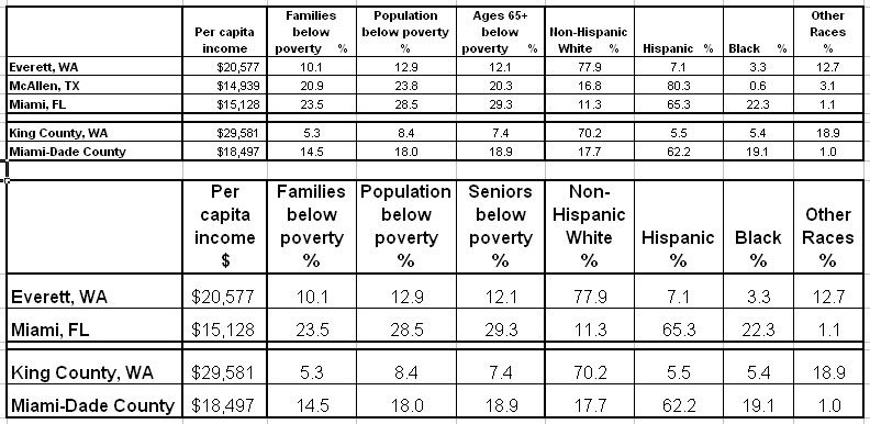
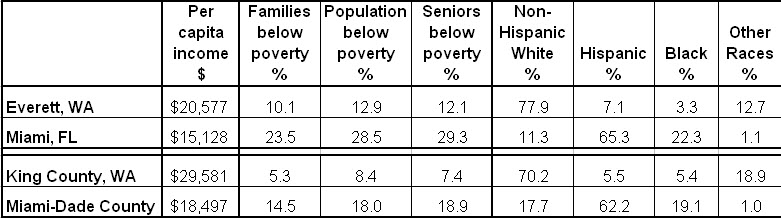
A thoughtful physician from Everett WA asked a perceptive question about the redistribution of Medicare payments from “low efficiency” to “high efficiency” areas, for example from South Bronx to Mayo, or, in the example that he gave, from Miami-Dade County to King County WA, the home of Microsoft. “Maybe I am wrong, but I think this was intended to reward high-quality, low-cost care.”
You’re not wrong. That was the stated purpose. But it simply rewards wealth and penalizes poverty. Costs are lowest where poverty is least, and quality follows. It’s best where poverty is least. High poverty areas (like Miami) have poorer and sicker seniors (see the chart below). The opposite is true for wealthy places with little poverty, like Everett and the surrounding King County.
This is not to say that there’s not waste in Dade and efficiency in King. Both may be true. It’s just that the income effect is so large, it swamps the others.
March Madness – Mayo $400M, the Poor $0
The final House “Manager’s Amendment to Reconcilliation” provides $400M for hospitals located in counties in the lowest quartile of Medicare spending, adjusted for age, sex and race but not income. Coupled with annual cuts of $10B in DSH and $1.5B for readmissions, this is bad news for the poor and the hospitals that care for them. Mayo wins!
Note that adjustments cannot be based on counties. Urban counties are too big and economically varied. When the extremes of wealth and poverty are averaged, mean household income is 128% of average in Washington DC, 113% in LA and 108% in Chicago (Cook County), all with dense and costly poverty ghettos. Without any poverty, mean household income in Olmsted County (home to Mayo) is the same as in LA. Very few truly poor counties will qualify for such payments. This is another example of the truism that “Poverty is the Problem; Wealth is the Solution.”
WSWS: Poverty, Health Care Reform and the Dartmouth Atlas
Joanne Laurier from the World Socialist Web Site (WSWS) interviewed me recently about Poverty, Health Care Reform and the Dartmouth Atlas. Here’s what I had to say:
“There are basically two problems with the Dartmouth group’s approach. One is methodological and the other is ideological. Although they are quick to point out that they have published 100 papers, these are based on only a few methodologies—and each is flawed. I’ll get into what’s wrong with their methodology later.
But even if they were right, they’re burdened with another problem—ideology. It’s not unusual for policy research to be burdened in this way. In the case of Dartmouth, it’s to an extreme. And, worse, through Peter Orszag, director of the Office of Management and Budget, their ideology has become the cornerstone of health care reform.
It was John Wennberg and his associate, Elliott Fisher, who led Orszag and others to believe that studies of geographic variation prove that doctors and hospitals over-treat and over-charge, to no benefit. And it was they who proposed the 30 percent solution, claiming that the money needed for health care reform was easily available—no new taxes would be required (as President Obama had promised).
If only health care were “more efficient,” the nation could save 30 percent of health care expenditures, $700 billion annually. And to create that “efficiency,” all that was needed was to force all providers to function like the Mayo Clinic (which cares predominantly for white, middle-class patients) and to utilize more primary care physicians (which Mayo doesn’t).
That’s what I call the sin of commission—the tragedy of misleading the process of health care reform. There’s a second sin—the sin of omission, or obfuscation. It’s not simply that the Dartmouth work on geographic differences is methodologically wrong and its conclusions incorrect, nor simply that its policy implications misdirected health care reform. It’s that there is another explanation for the geographic differences, which has to do with differences in the distribution of poverty.
So all the while that they talked about saving money by reducing wasteful geographic variation (by providing less care where it’s actually needed), the fundamental needs of the poor and the large added costs of caring for them were ignored.
It’s actually worse. Poverty was denied, because it couldn’t be both ways. Either the Dartmouth group was right and the high costs in some areas were because of too many specialists and hospitals doing too many unneeded things, or this higher spending was due to the added costs of caring for the poor. The truth is that it is the latter.
Therefore, the only way to really save money is to make a long-term commitment to ameliorating the high health care costs that are a result of poverty and other social determinants of disease. Not that there aren’t inefficiencies. But physicians have been dealing with inefficiencies as long as I’ve been a doctor—which is 50 years—and certainly before that.
As medicine evolves, there are always more inefficiencies to deal with, but as fast as we deal with them, new ones emerge. So constant diligence is necessary. But is medicine more efficient than in 1960? You bet it is. And is poverty a bigger problem for health care spending now than it was then? You bet. We seem to know how to make things more efficient. But as a nation, we aren’t very good at reigning in poverty. It just grows.”
Read more on the WSWS Web page.
The Demise of Dartmouth, but Who’s To Blame?
An important article appeared in today’s NYT, describing a new paper by Peter Bach, which is in today’s NEJM. Peter’s paper (“A Map to Bad Policy“) debunks the Dartmouth Atlas and cautions against its use. As I said in the Wash Post in September, the Dartmouth Atlas is the “Wrong Map for Health Care Reform.”
More damning even than Peter’s analysis was Elliott Fisher’s reply: “Dr. Fisher agreed that the current Atlas measures should not be used to set hospital payment rates, and that looking at the care of patients at the end of life provides only limited insight into the quality of care provided to those patients. He said he and his colleagues should not be held responsible for the misinterpretation of their data.” Really? It was someone else’s interpretation? OK, Elliott, you’re not responsible. Just stand in the corner.
Peter is not the only leading epidemiologist to debunk Dartmouth in recent days. There’s also the report this week from the U of Wisconsin and RWJ by Pat Remington (another leader), showing that people who have the poorest health (and, therefore, the highest health care costs) live in the poorest counties (see my blog report and an earlier discussion of poverty and health care). And there’s the recent paper by Ong and Rosenthal (co-authored by Jose Escarce, editor of HSR, the leading health services research journal), showing that, when all care is measured (not simply end-of-life care, as measured by Dartmouth), hospitals that provide more have lower mortality, which was confirmed in the current issue of Medical Care by Barnato and associates at the U of Pittsburgh. When it rains, it pours.
What’s doubly important about the death of the Dartmouth Atlas is that it was the cornerstone of health care reform. Right from the start, Peter Orszag, director of OMB and the administration’s architect of health care reform, accepted Dartmouth’s ideological principles that health care spending was driven by doctors and hospitals who over-treated and over-charged, to no benefit. The funds for health care reform were readily available by simply getting rid of geographic differences. That alone would save 30% of health care spending ($700B). And that could be accomplished by making everything look like Mayo (white, middle class and efficient) and by having more primary care physicians (which Mayo doesn’t). And best of all, it could assure that no new taxes would be needed, just as President Obama had promised.
The problem is that it didn’t make sense. Voters knew it, even if they didn’t know the methodological details. And the CBO figured out. And congressmen had to scramble to find ways to pay for health care reform without actually paying for it, because it was supposed to be for free – the 30% solution said so, and folks all over Capitol Hill cited it. And now the spiral of hypocrisy has finally unraveled. Like Madoff’s investments, the Dartmouth Atlas was shadows and mirrors. But this time, the price tag is more than the $50B that Madoff cost. It’s the likely loss of health care reform. But don’t worry, Elliott. We won’t blame you.
County Health and Poverty
A new study from the University of Wisconsin and RWJ identifies the five counties in each state with the poorest health (also the five healthiest). According to Marketplace, the research concludes that economic status may be even more important than access to care. The map from this study is reproduced below. Beneath it is a map showing counties with the most (and the least) poverty. Circles identify counties that appear on both maps. There is a remarkable degree of overlap between the very poorest counties and the sickest counties. Note a similar relationship between the wealthiest and the healthiest.

 The lesson is that poverty is geographic, poor health tracks poverty and expenditures track poor health. If we’re going to do health care reform again, let’s get it right. No more “30% solution” this time. But a lot of attention to the links between poverty, health status and health care spending.
House Members Urge Pelosi to Limit DSH Payment Cuts
In a letter that was organized by Reps. Reyes (D-TX), Lewis (D-GA) and Schakowsky (D-IL), 104 members of the House urged Speaker Pelosi to ensure that the final health reform bill does not lower Medicaid and Medicare Disproportionate Share Hospital (DSH) payments more than in the House-passed bill, which already is too much. “To retain our health care safety net’s stability, we believe that future DSH payments must continue to recognize financial losses sustained by these providers due to Medicaid reimbursement shortfalls and uncompensated care,” they wrote. The House bill would cut DSH payments by $20 billion over 10 years, while the Senate bill would cut $43 billion, approximately 25% of what otherwise would be paid. The rationale for lowering DSH payments is that more patients will be insured. But half or more of them will have incomes low enough to qualify for Medicaid, even at the Senate’s eligibility level of 133% of poverty (the House bill calls for 150%). And it’s because the costs of caring for low-income patients are so high that DSH now subsidizes hospitals that provide a lot of it. So the last thing anyone should want to do is cut DSH as more poor patients are brought into the system.
Who would be most hurt? The map below shows the amount of DSH paid by Medicare on behalf of poor patients in the various counties, expressed as DOLLARS per POOR POPULATION (individuals below the poverty level). Note: orange is the most, dark blue is next, pale blue is least. Areas with the densest concentrations of poverty, such as in the south, northeast and California, receive the most, and they will lose the most. The northwest and upper-Midwest win again. Of course, the Dartmouth Atlas tells us that these latter regions are “efficient” and deserve to be rewarded. That’s malarkey! Paying for health care reform on the backs of the poor is poor social policy. 
Map by Matthew Cooper
Deficits, Jobs and Health Care
Commenting on the President’s budget, an editorial in the Times on Feb 2nd juxtaposed three of our nation’s dilemmas: the deficit, jobs and health care.
“President Obama got his priorities mostly right. The deficit, compared with what it could have been, is $120B. That’s a lot of money. But it’s not too much at a time of economic weakness, when deficit spending is needed to put Americans back to work.”
“Medicare and Medicaid will cost $788B; that should be another reminder of why the country needs health care reform.”
The fundamental question about health care spending is, therefore, what does it mean for jobs? Approximately 15 million people work in health care, and that doesn’t count jobs at the 140 companies that specialize in constructing health care facilities or 56,000 pharmacies or the dreaded health insurance companies, nor does it include all of the jobs of people supplying goods and services to the 18 million folks engaged in health care in these various ways. But a more important question is, where is the job growth? The answer is health care. Over the past decade, the growth in health care jobs has equaled the total growth of jobs. Many are high-skilled, but many are entry-level jobs that help to move people out of poverty. So we had better be careful in measuring the impact of health care. Quite apart from its beneficial effects on well being, it just may be the engine of the economy.
Twisted Truths and the State of Health Care Reform
A friend – a highly respected health economist – expressed concern that my criticism of the Dartmouth group’s studies “is a justification to do nothing.” I told him that I, too, have been concerned that my critiques might be taken that way, but they shouldn’t. What I have tried to do is to prevent the wrong things from being done. Regulations based on geographic variation will do nothing to improve the quality curve. Quality is not geographic. But poverty is, and despite the Dartmouth folk’s denial, what the studies of geographic variation demonstrate is that poverty is a major contributor to health care costs. That’s why Mayo shuns poor Medicaid and Medicare patients. However, I have had an even bigger concern – that the Dartmouth group’s twisted logic would eventually be figured out, and its close association with the Orzag-Obama plan would undermine health care reform. It’s difficult to conclude that this was the problem in Massachusetts, but “lack clarity,” “arrogance of ideas” and similar expressions of distrust with health care reform have been cited as reasons for the election’s outcome. Twisted truths are not a basis for sound policy. We’ve got to get this right if health care reform is to proceed on a rational basis.
Connecting the Dots from Urban Poverty to Excess Expenditures

Meeting Poverty on “Meet the Press”
The favorite sound bite of Dartmouth disciples is to compare some high cost locale with a low cost locale. First it was Miami vs. Mayo, then Birmingham vs. Grand Junction, then Los Angeles vs. Green Bay and now it’s Los Angeles vs. Portland. This time, Tom Brokaw delivered the message on Meet the Press: “At UCLA Medical Center, they spend $92,000 on the last two years of a life, but in Portland, Oregon, just north of there (it’s actually 825 miles north of there), they spend $52,000 because they’ve got better controls on Medicare. So until you begin to pay for value and pay for performance, health care reform is not going to work.”
What do Miami, Birmingham and Los Angeles have in common, and what do Rochester MN (home of Mayo), Grand Junction CO, Green Bay WI and Portland OR have in common. One thing is poverty. The maps below show the density of poverty in each (light green shows census tracks with 20-40% poverty and red shows tracks with >40% poverty). Miami, Los Angeles and Birmingham all have poverty ghettos. There certainly is poverty in the other cities, but not in ghettos. The dense poverty ghetto in central Los Angeles includes more than 2 million poor people.
So is it “better controls” or less poverty that results in lower spending. The first has a certain appeal, and we do seek better ways of doing things, but the latter is what’s really driving spending higher, and nowhere more vividly that in Los Angeles. Poverty is expensive, and ghetto poverty is really expensive. To paraphrase Mr. Brokaw, until you begin to solve the problem of poverty, health care reform is not going to work.
