County Health and Poverty
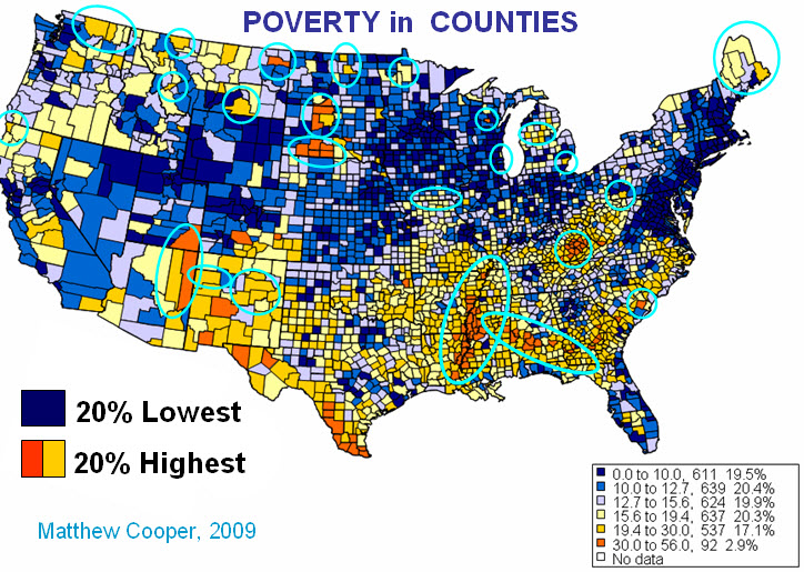
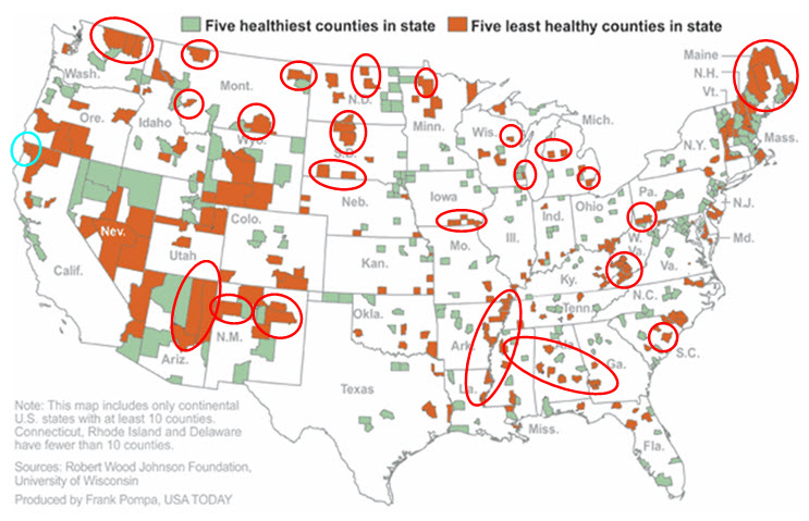
A new study from the University of Wisconsin and RWJ identifies the five counties in each state with the poorest health (also the five healthiest). According to Marketplace, the research concludes that economic status may be even more important than access to care. The map from this study is reproduced below. Beneath it is a map showing counties with the most (and the least) poverty. Circles identify counties that appear on both maps. There is a remarkable degree of overlap between the very poorest counties and the sickest counties. Note a similar relationship between the wealthiest and the healthiest.
 The lesson is that poverty is geographic, poor health tracks poverty and expenditures track poor health. If we’re going to do health care reform again, let’s get it right. No more “30% solution” this time. But a lot of attention to the links between poverty, health status and health care spending.


2 comments